

ROLE: Mobile App/Product Design Lead
CLIENT: Fastweb (Monster Worldwide)
TOOLS: Photoshop, Illustrator, Keynote
CLIENT: Fastweb (Monster Worldwide)
TOOLS: Photoshop, Illustrator, Keynote
Challenge
Fastweb's web product had a huge scholarship-matching engine behind it, but none of that translated to mobile. The product team wanted an app that was "simple, quick and fun," built around swipe-based matching, deadline tracking, and status indicators, and it needed a cohesive visual system before engineering could start building.
Impact at a Glance
1.5M+
Scholarships in Fastweb's database, worth over $3.4B
4 screens
onboarding flow that teaches swipe-to-match
5-star
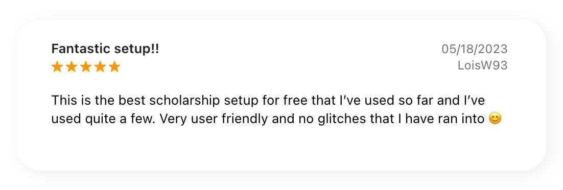
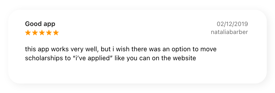
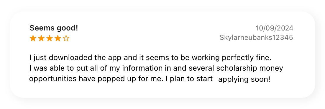
App Store reviews calling the app "user friendly" with "no glitches"
1.5M+
Scholarships in Fastweb's database, worth over $3.4B
4 screens
onboarding flow that teaches swipe-to-match
5-star
App Store reviews calling the app "user friendly" with "no glitches"
Solution
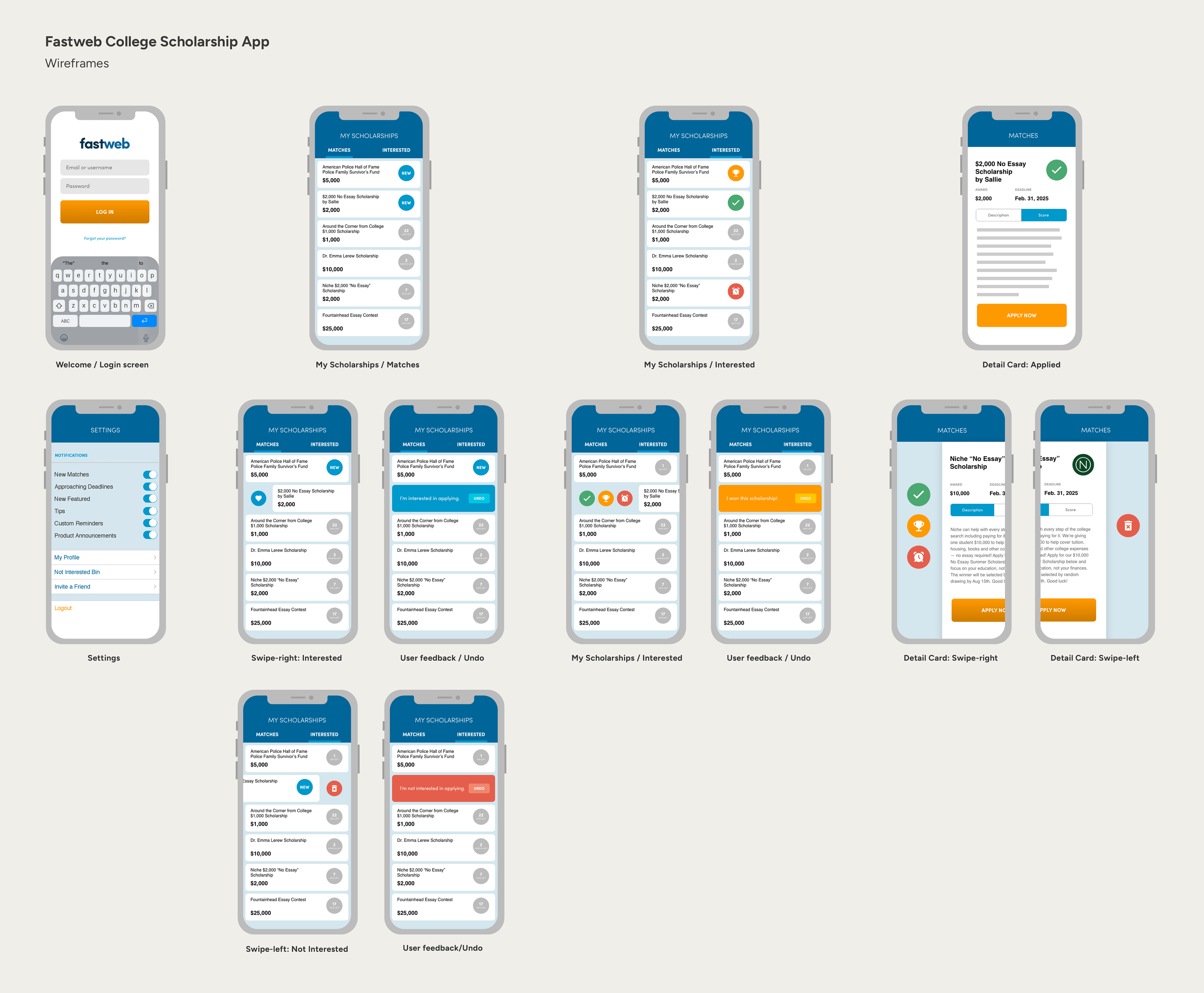
I started from a short product requirements doc that broke the app into four core sections, My Scholarships, My Deadlines, Featured Scholarships, and Push Notifications, and built full iOS wireframes for each flow before touching visual design.
2 buckets Matches and Interested tabs replacing the website's single scrolling list, giving users one clear system to track scholarship status
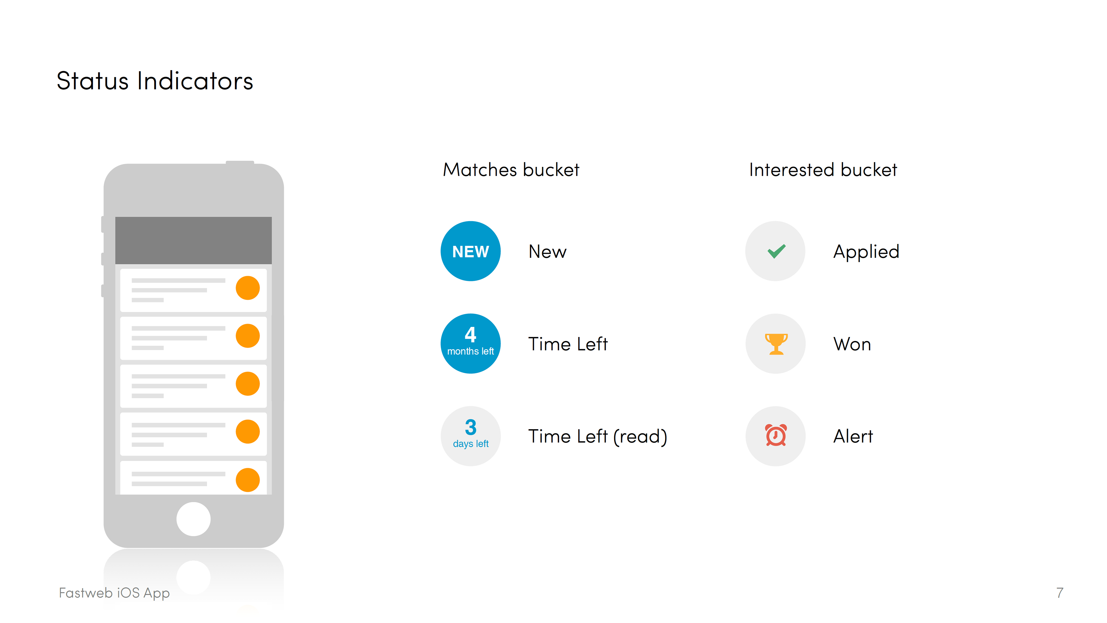
I built a five-icon status system: New, Time Left, Applied, Won, Alert. The goal was that a user scrolling through their Matches list could read a scholarship's entire status without ever opening the detail card. The detail card was built around a single action: getting the user to "Go Apply" as quickly as possible, with just enough context, award amount, deadline, eligibility, to make that decision.
Look & Feel
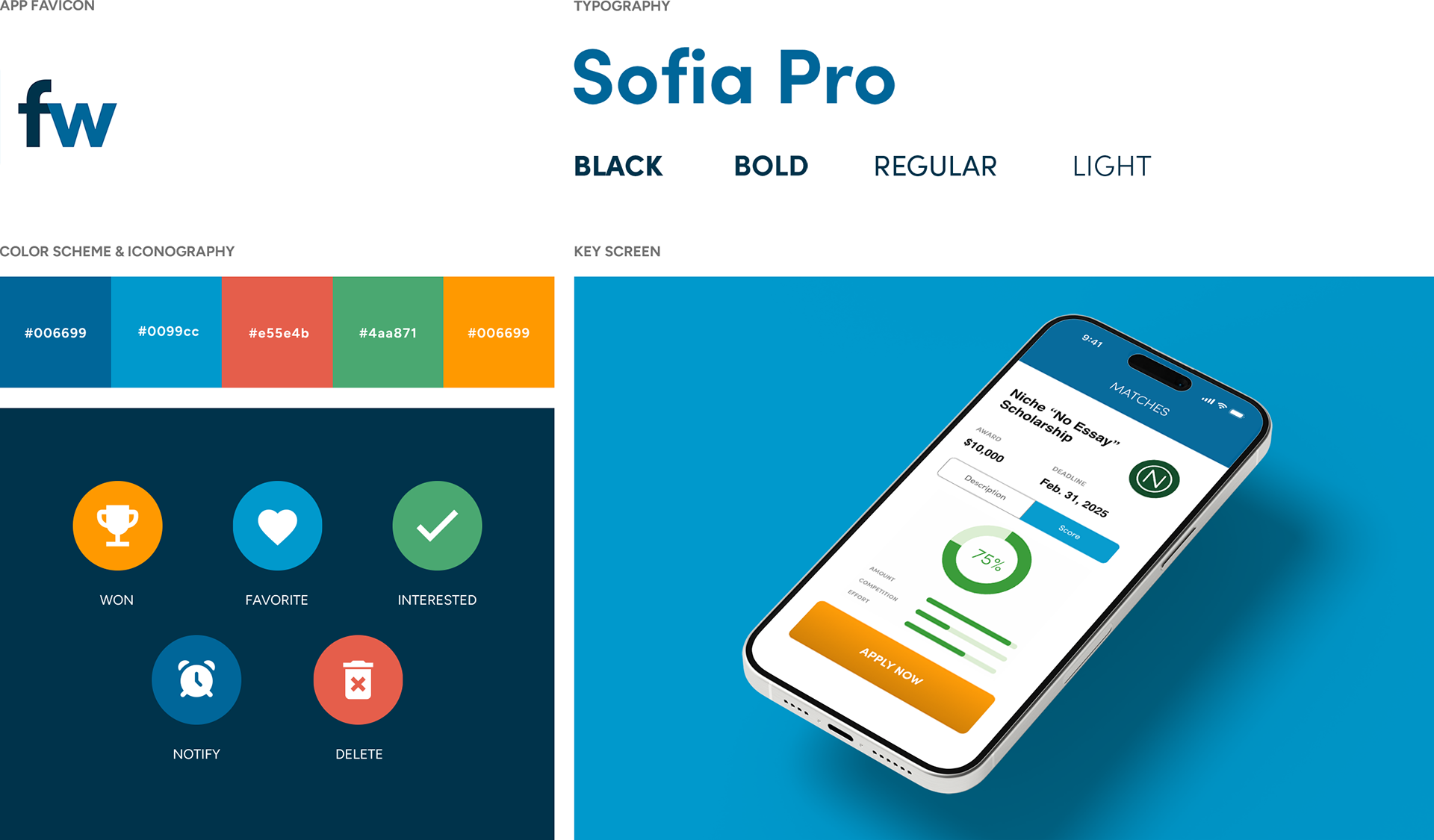
To give the app its own identity while staying tied to the Fastweb brand, I created a style guide anchored on Sofia Pro typography, a five-color palette, and a custom icon set, then used that system consistently across every screen, from the login flow to the settings page.
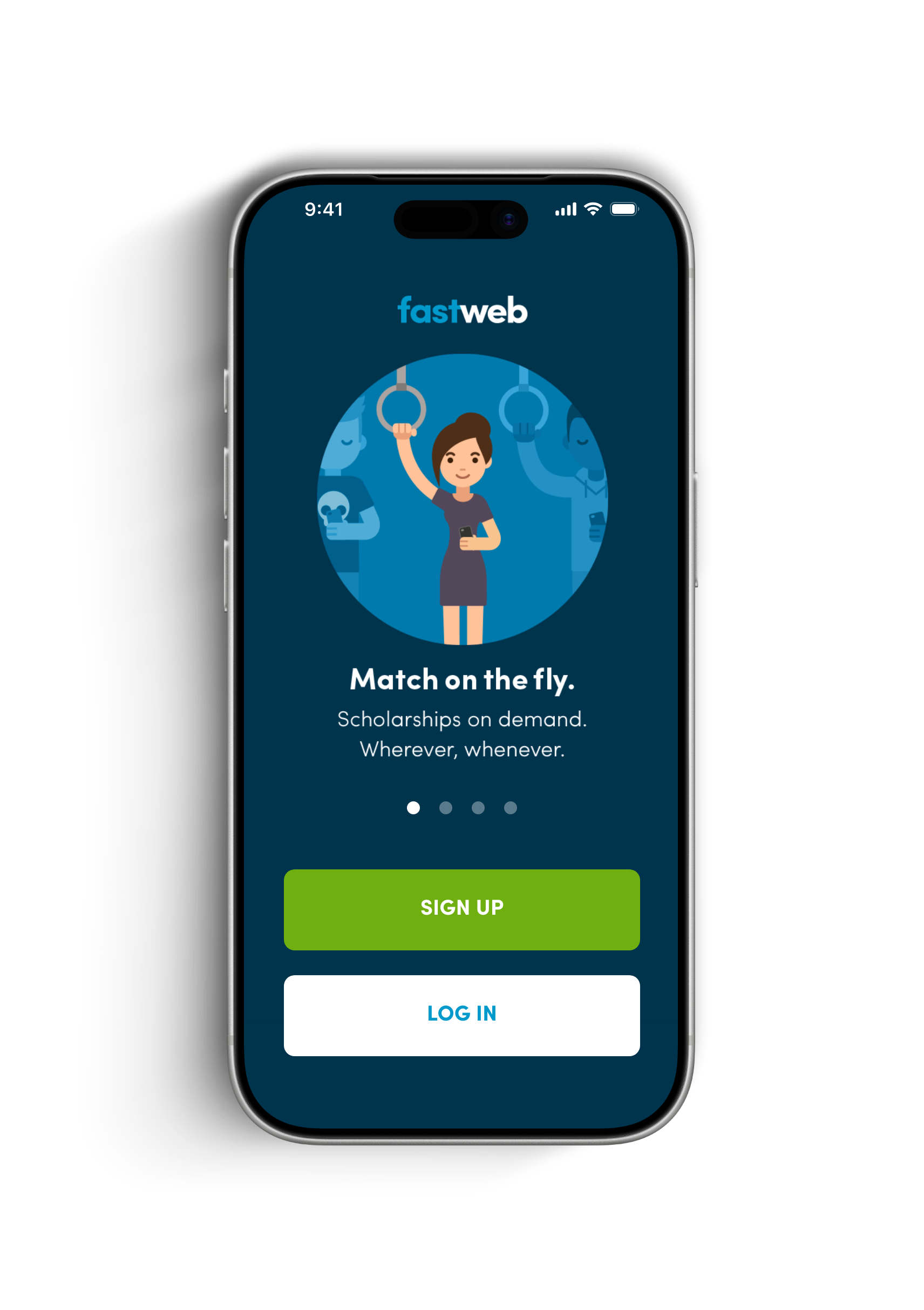
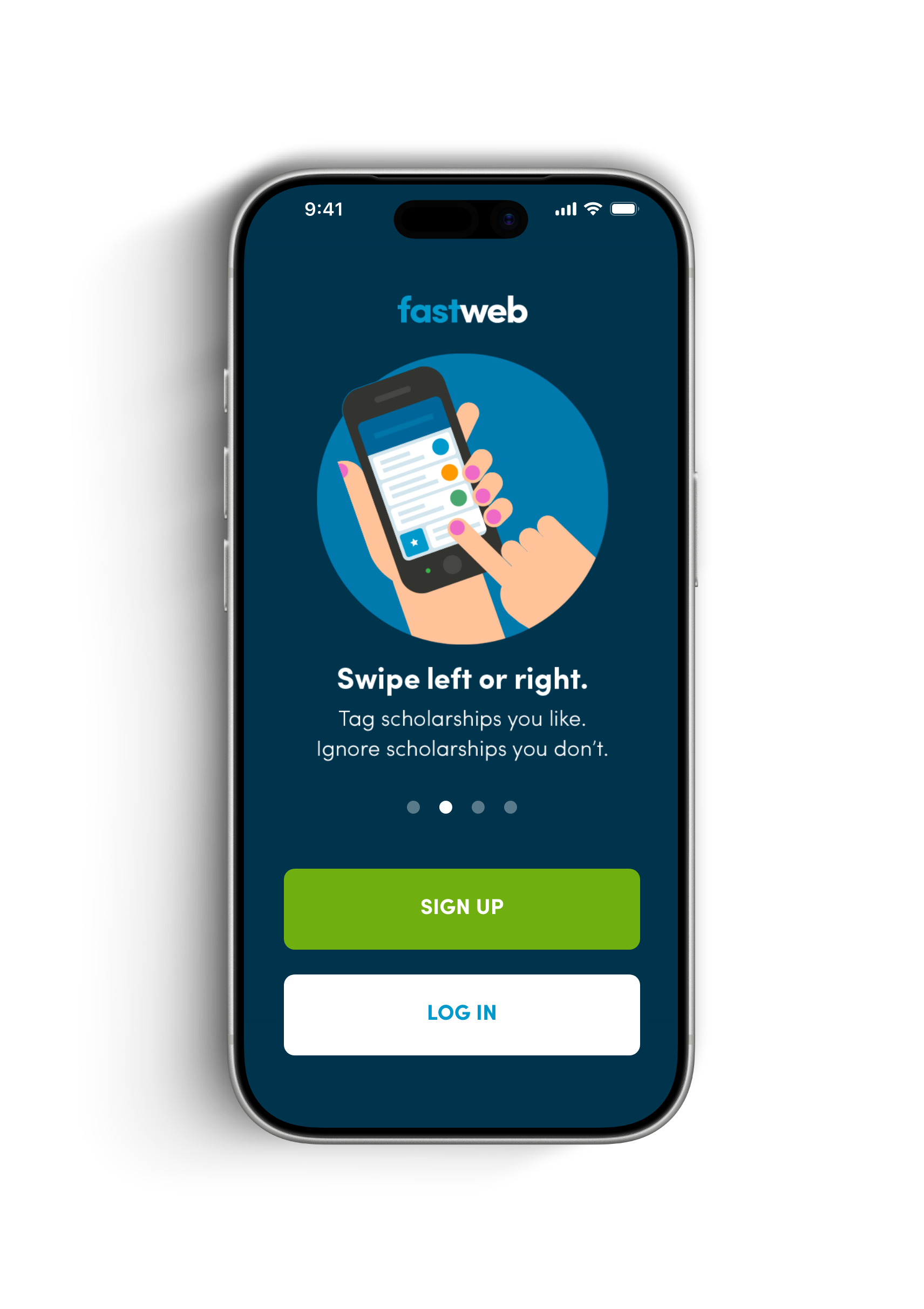
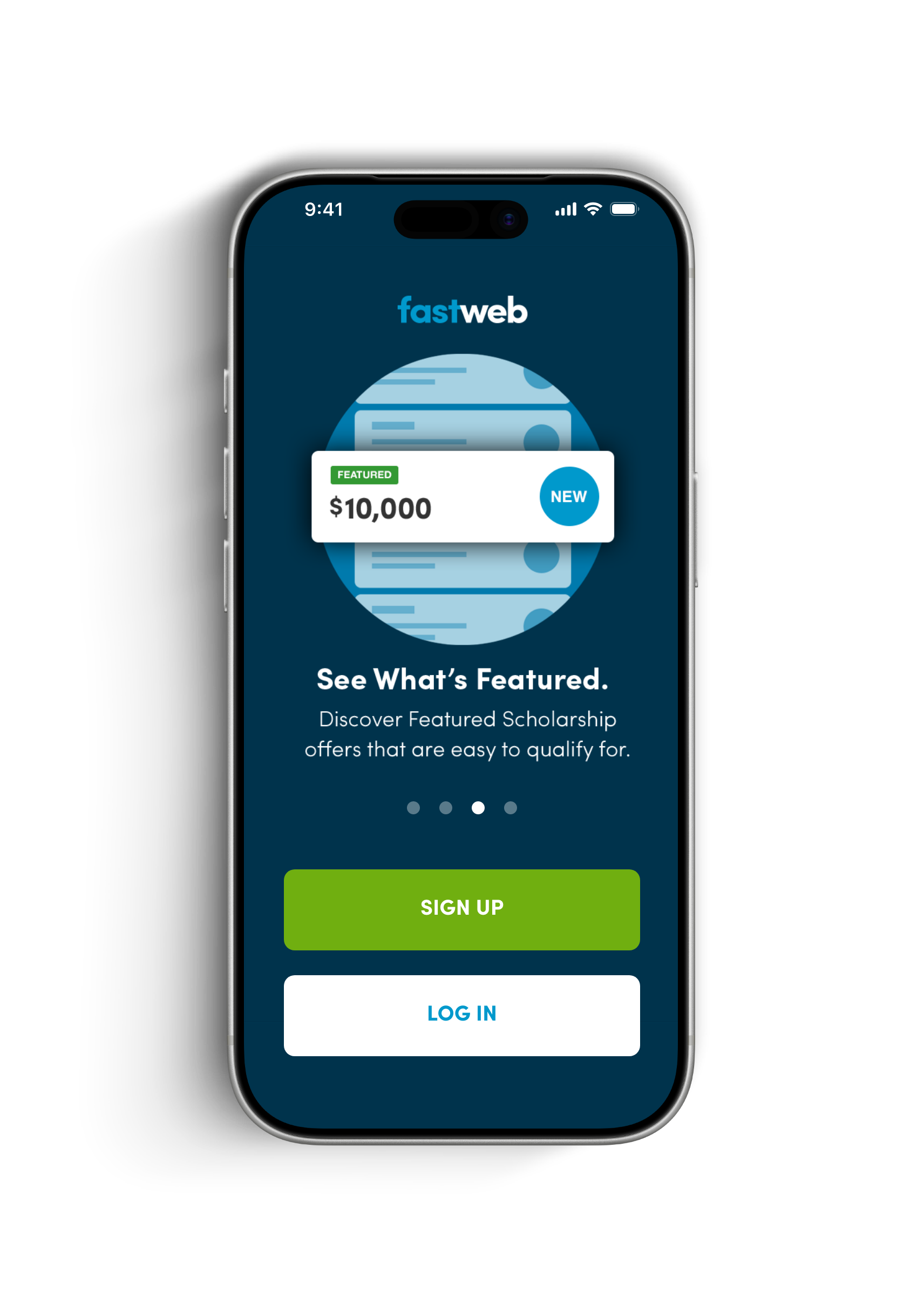
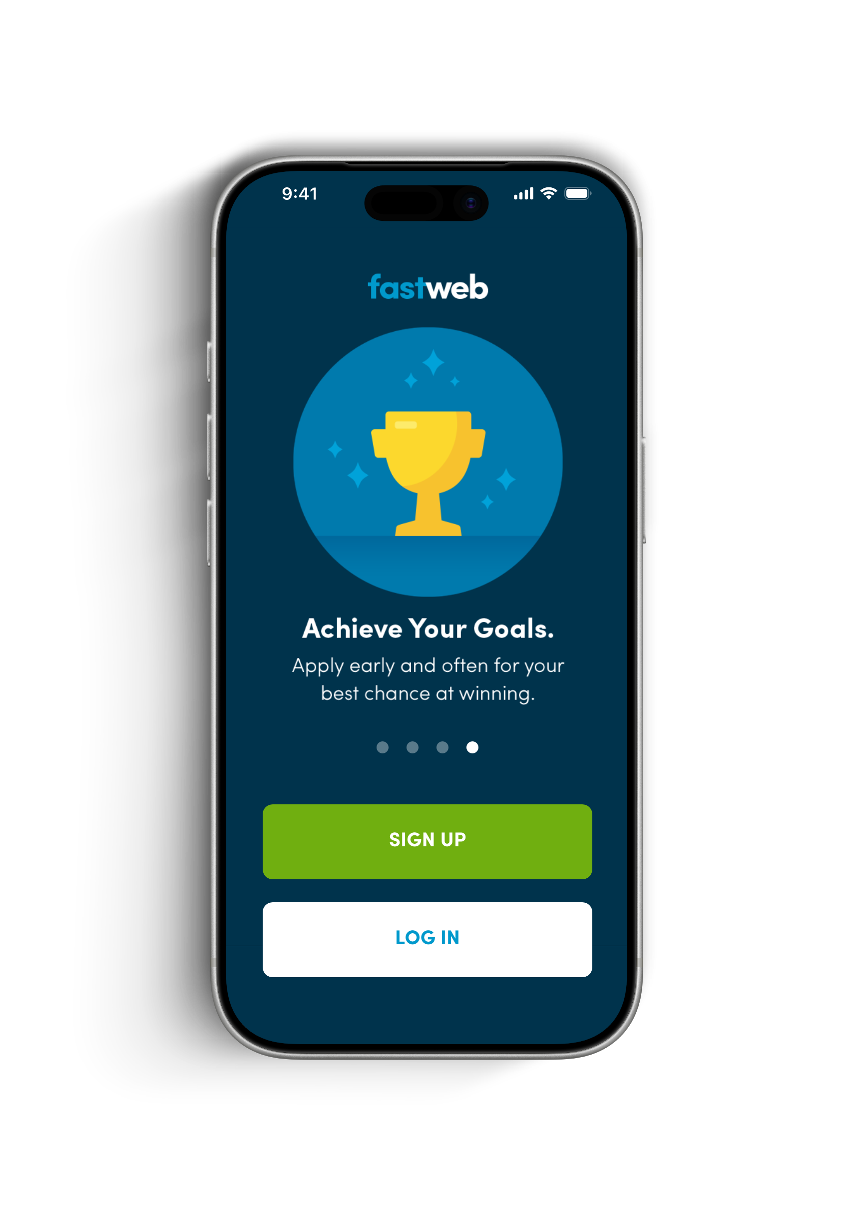
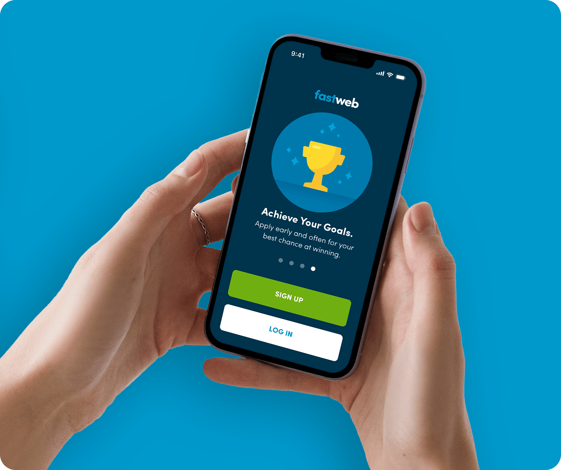
The last piece was the onboarding sequence: four screens, Match on the Fly, Swipe Left or Right, See What's Featured and Achieve Your Goals, each pairing a simple illustration with one short headline and a single line of supporting copy.
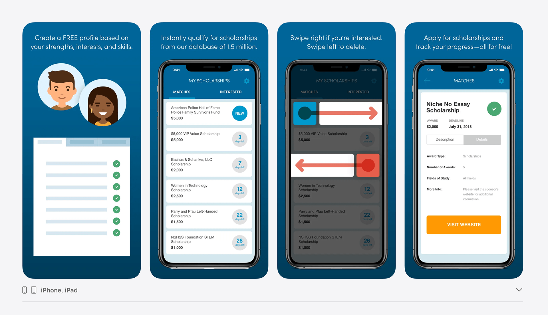
Finally, app Store screenshots were created to walk new users through the four-step flow: create a profile, get matched, swipe to sort, and apply.
Users Noticed
App Store reviewers called it the best free scholarship setup they'd used and praised it as user friendly with no glitches, validating the swipe-based matching mode.
Results and Business Impact
Shipped as Fastweb's flagship mobile app.
The design went live under Monster Worldwide as the official Fastweb College Scholarships app.
Real users confirmed the core bet paid off.
App Store reviewers called it the best free scholarship setup they'd used and praised it as user friendly with no glitches, validating the swipe-based matching model.
A repeatable system, not a one-off screen set.
The Sofia Pro type system, five-color palette, and icon library gave engineering a complete spec to build from and gave Fastweb a visual identity distinct from the web product.
Shipped as Fastweb's flagship mobile app.
The design went live under Monster Worldwide as the official Fastweb College Scholarships app.
Onboarding did the teaching.
The four-screen onboarding sequence let new users learn swipe-to-match and deadline tracking without a tutorial overlay or written instructions.