

ROLE: Creative Direction, Product Design Manager
CLIENT: Fastweb.com (9M+ active members)
TOOLS: Adobe Suite, Prototyping tools
CLIENT: Fastweb.com (9M+ active members)
TOOLS: Adobe Suite, Prototyping tools
Challenge
Stakeholders wanted to grow organic traffic to the Fastweb homepage and convert more of those visitors into members, but the homepage hadn't been updated to reflect the brand's story, was weighed down by unoptimized images, and wasn't built mobile-first for a mostly mobile audience.
At the same time, NPS survey data pointed to a second problem: once people joined, they struggled to organize their scholarship matches.
At the same time, NPS survey data pointed to a second problem: once people joined, they struggled to organize their scholarship matches.
Impact at a Glance
+78%
Increase in monthly site visits, comparing the six months before launch to the three months after
(410,446 → 733,401 monthly visits)
+21%
Increase in average monthly new members
(60,000 → 72,378)
+4 pts
Increase in organic search traffic share
(26% → 30% of total traffic)
Increase in monthly site visits, comparing the six months before launch to the three months after
(410,446 → 733,401 monthly visits)
+21%
Increase in average monthly new members
(60,000 → 72,378)
+4 pts
Increase in organic search traffic share
(26% → 30% of total traffic)
Solution
Design Consistency
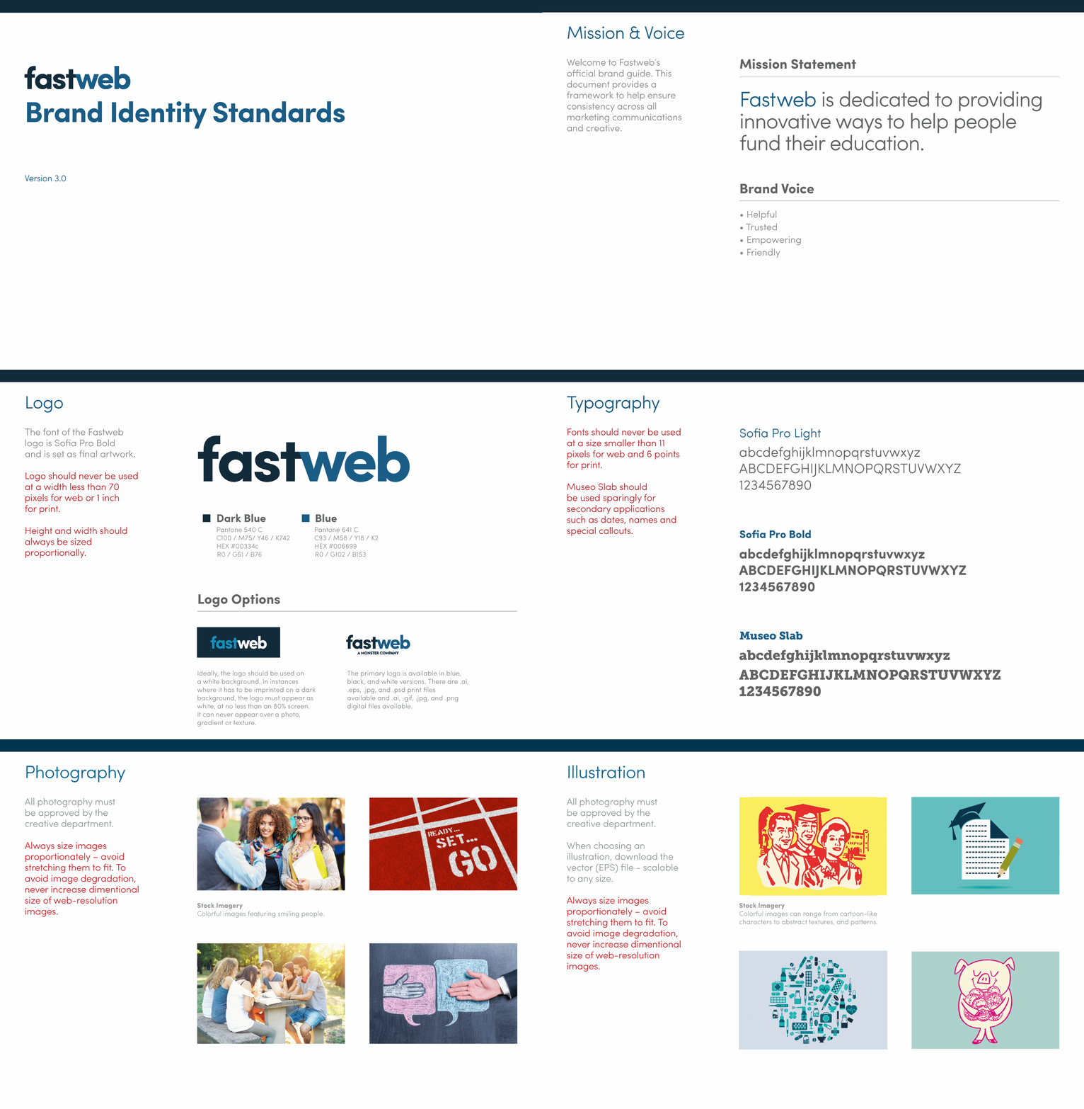
Modernizing the homepage meant modernizing the system underneath it first. I rebuilt Fastweb's brand identity standards from the ground up: a refreshed logo, a new color palette, and updated typography built to read clearly across devices. The guide codifies colors, typography, and button and table styles so anyone on the team has a single source to design or build from.
Mobile-First
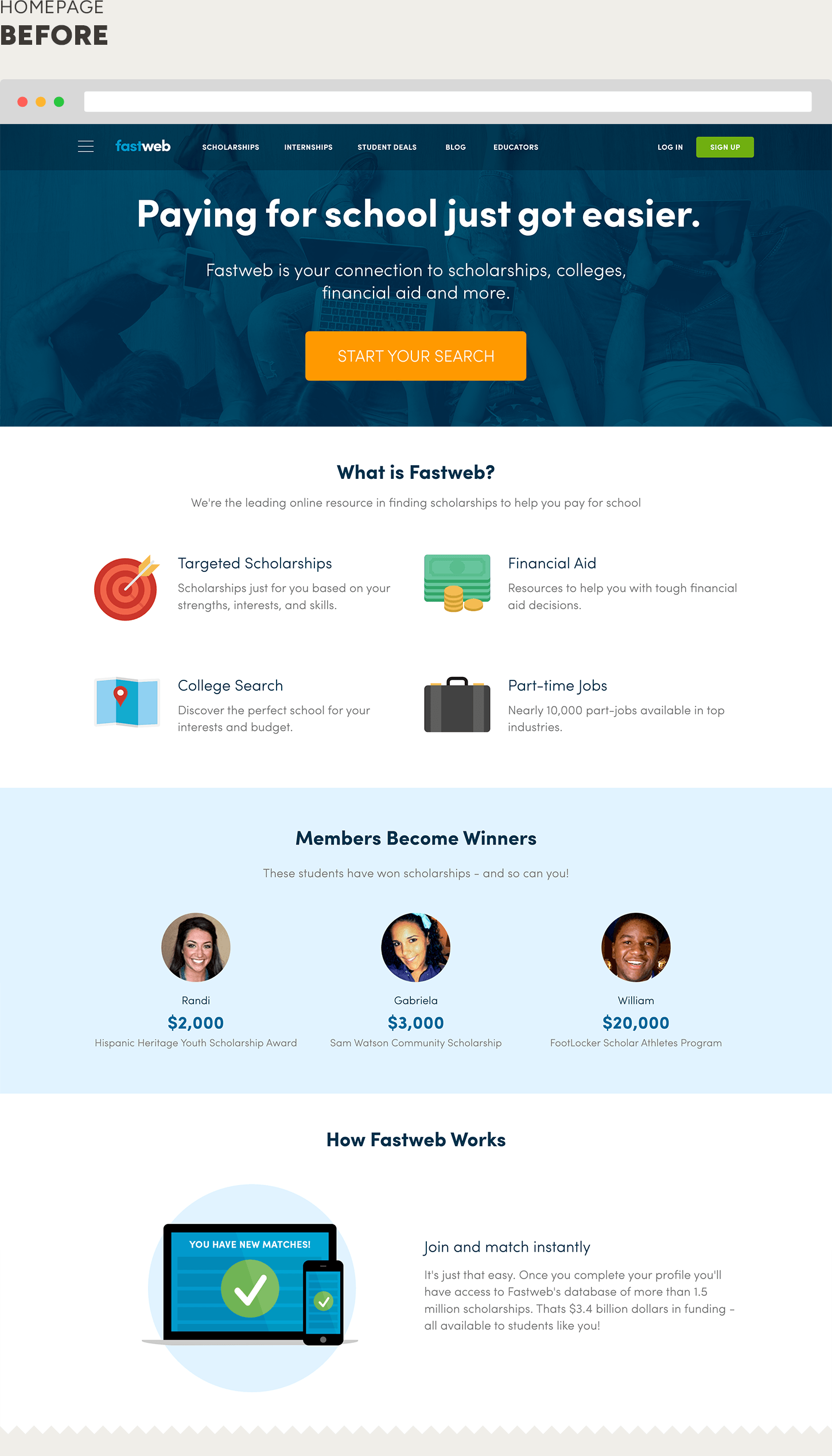
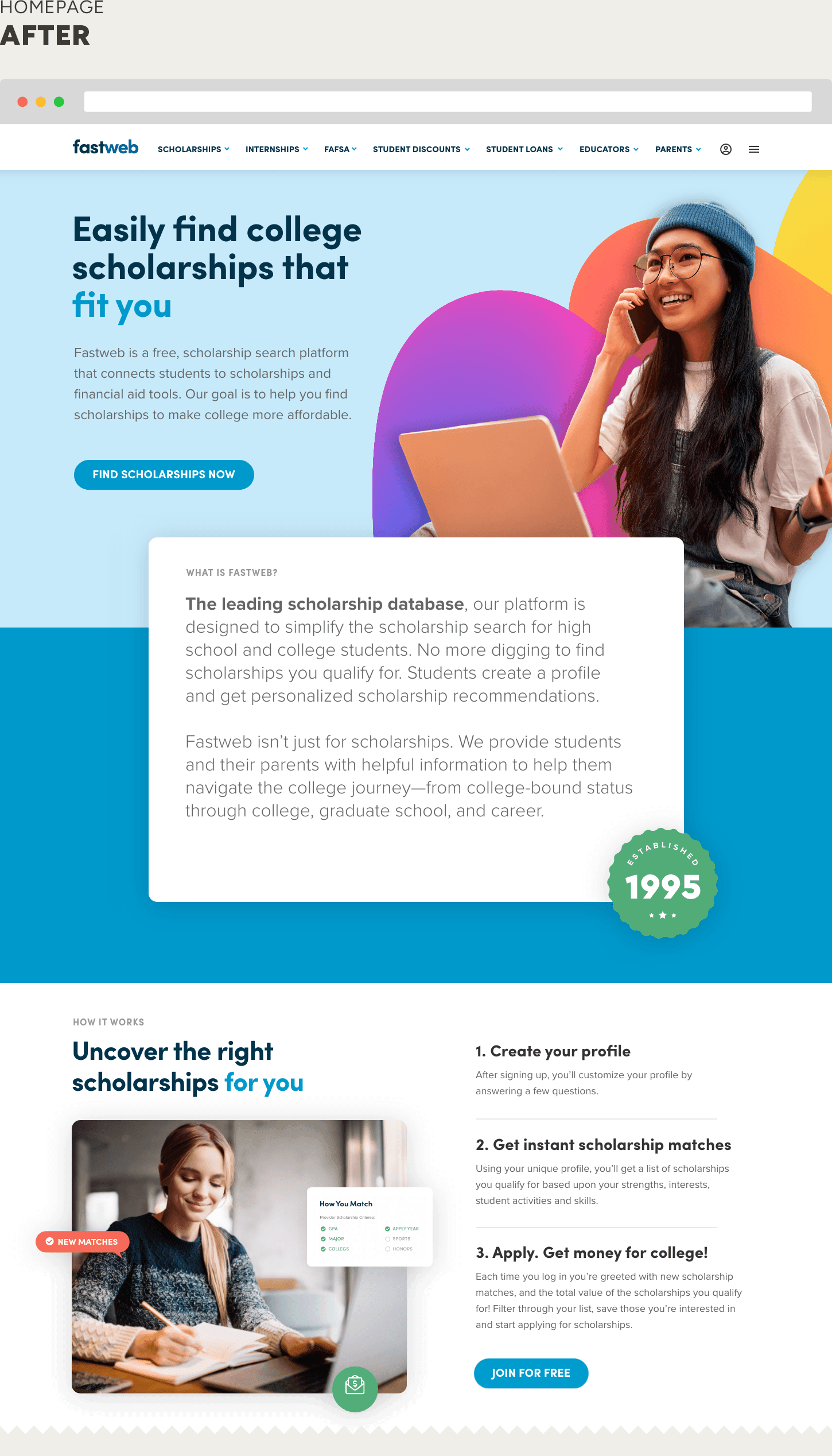
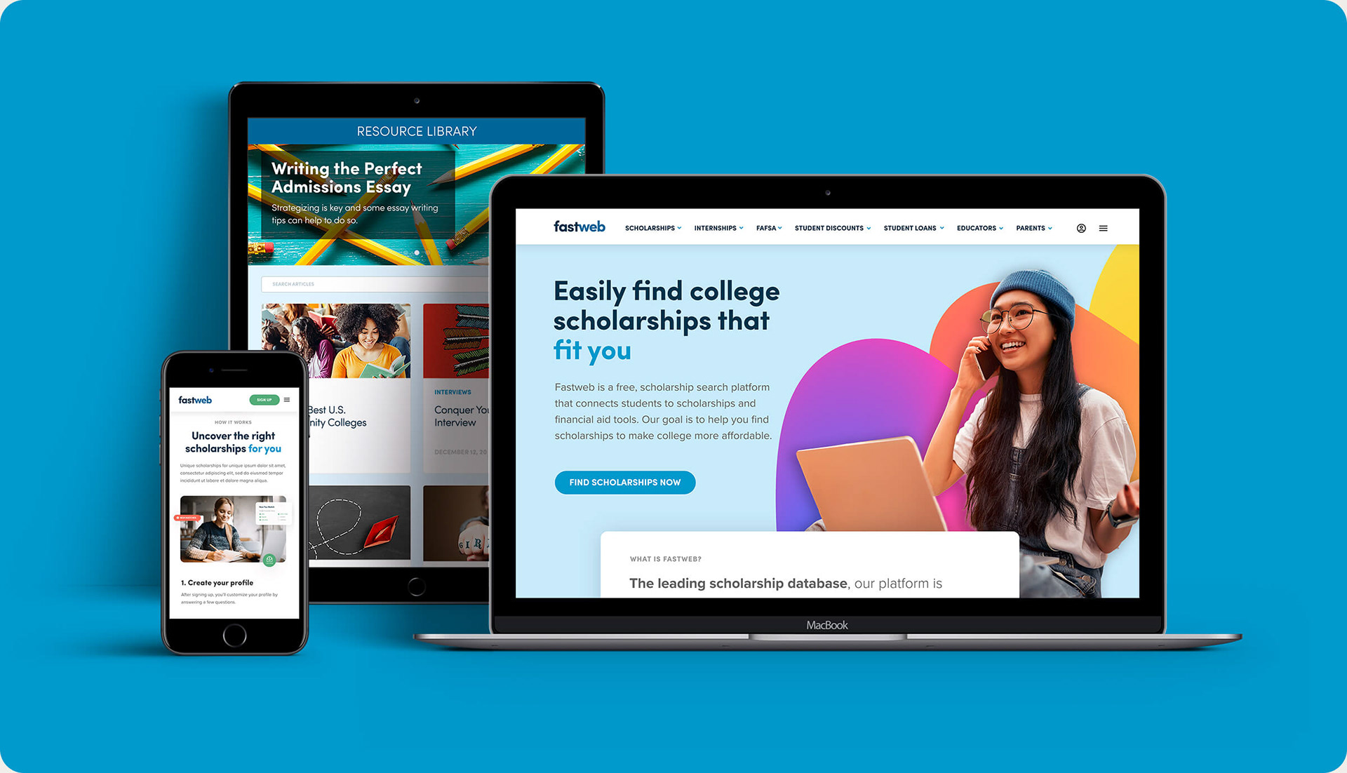
I led the redesign of the Fastweb homepage end to end for a phone-majority audience: modernizing the visual identity, rewriting copy to hit SEO targets, and rebuilding the layout from the smallest screen up, so mobile got the design focus it deserved.
In parallel, I optimized images site-wide, using WebP with JPG fallback, three responsive sizes instead of one oversized asset, and filenames and alt text rebuilt for SEO. Faster pages on mobile connections were the whole point, not a side effect.
Built to Scale
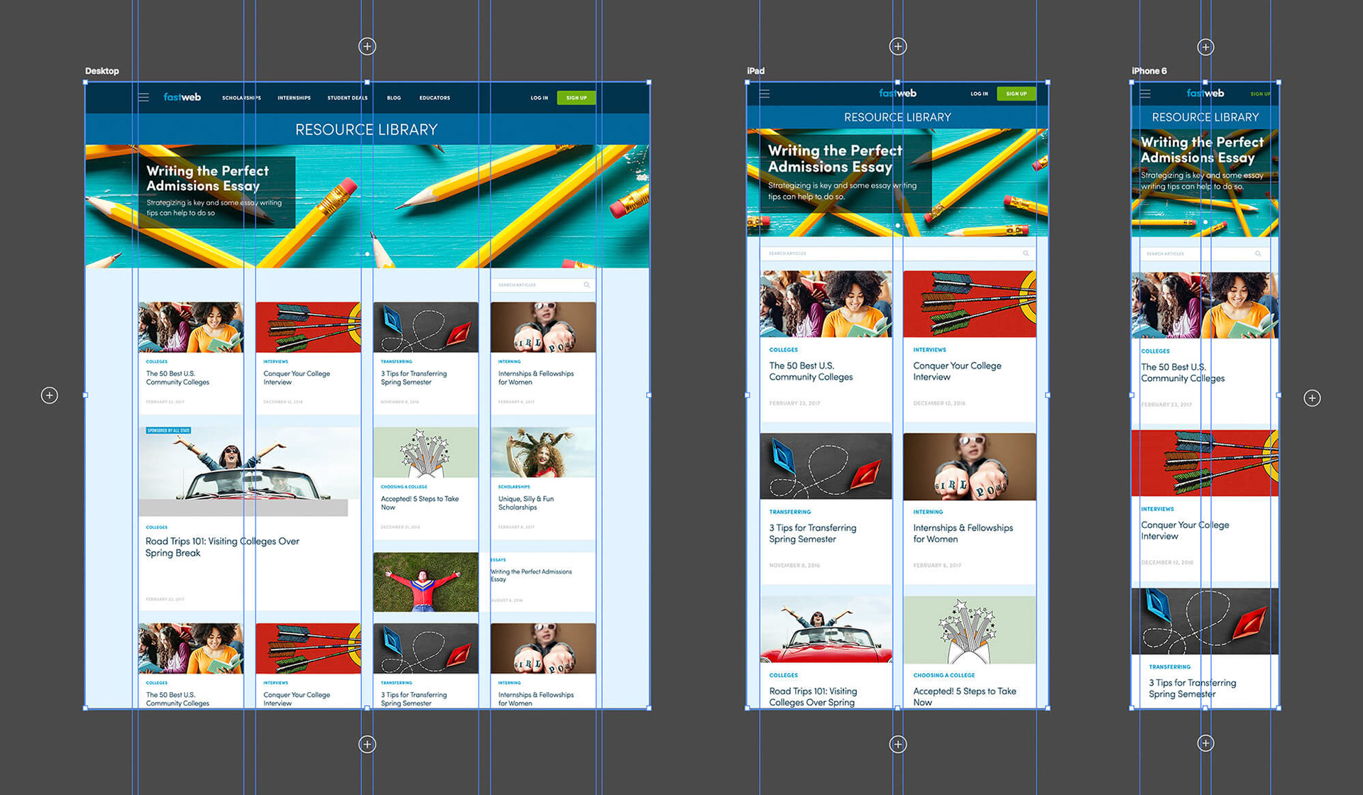
From there, I designed every page at desktop, tablet, and mobile breakpoints, laying out the grid explicitly at each size rather than assuming it would just scale down. Those layout guides became the spec engineering built from, so responsive behavior was defined up front instead of worked out during handoff.
Full-Site Redesign
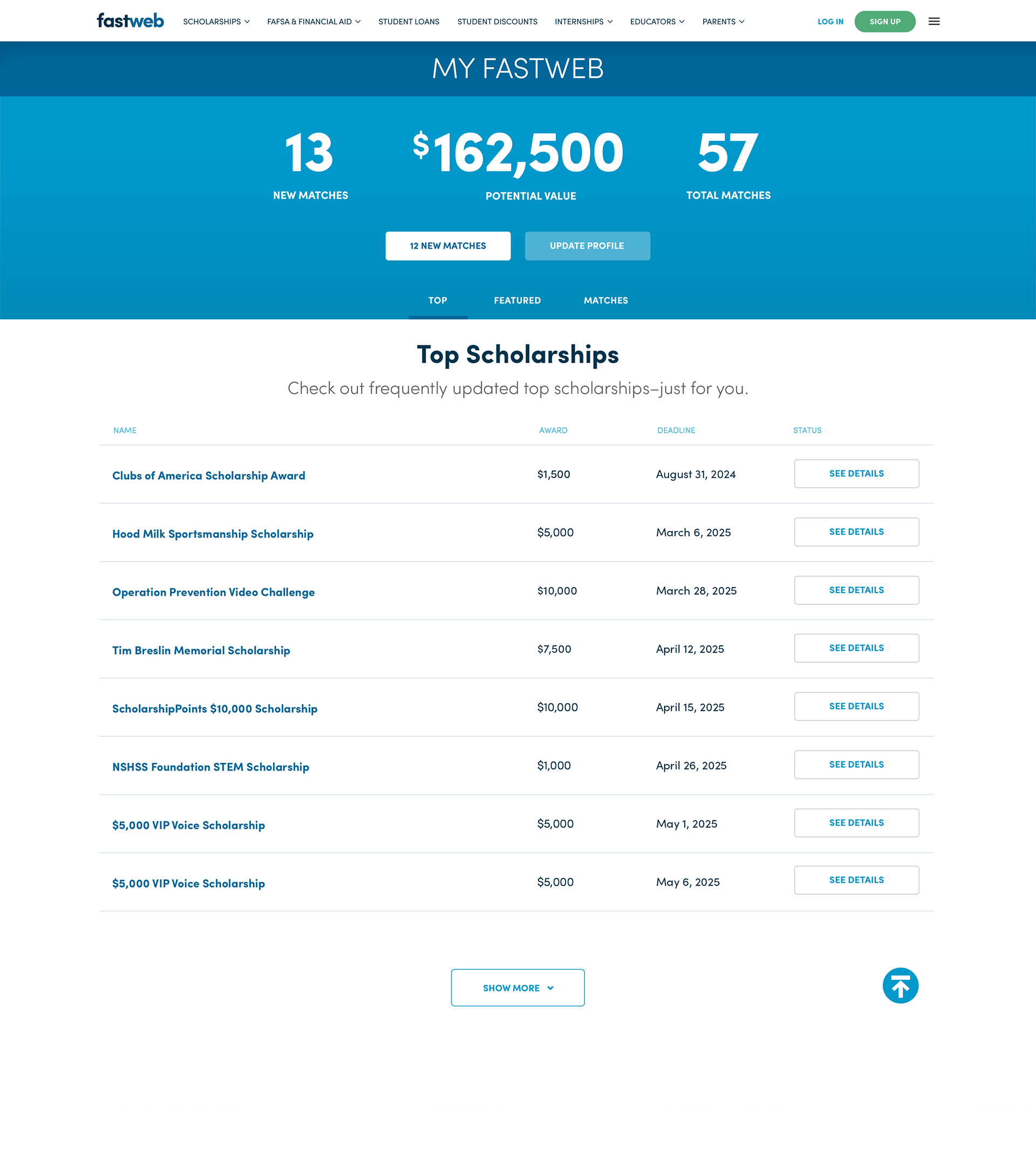
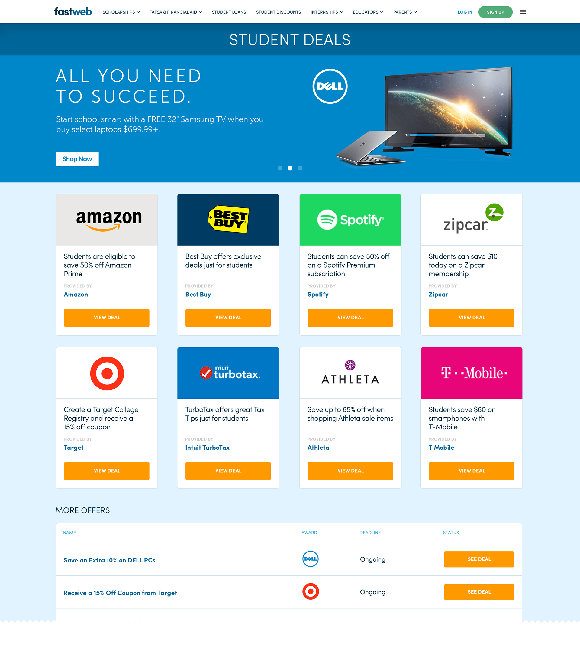
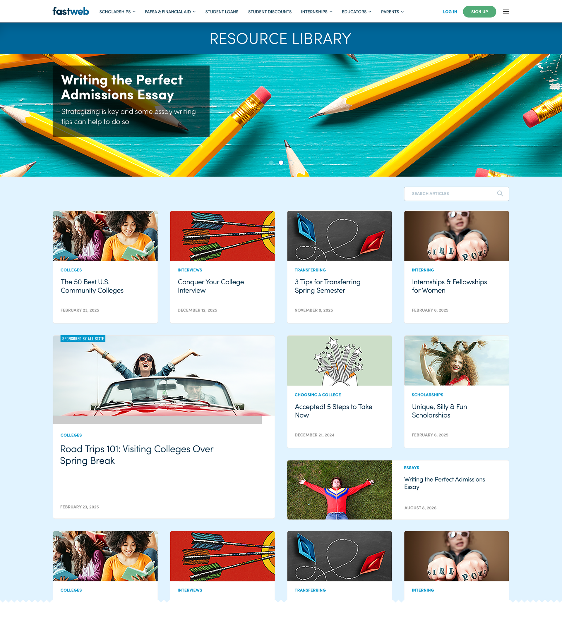
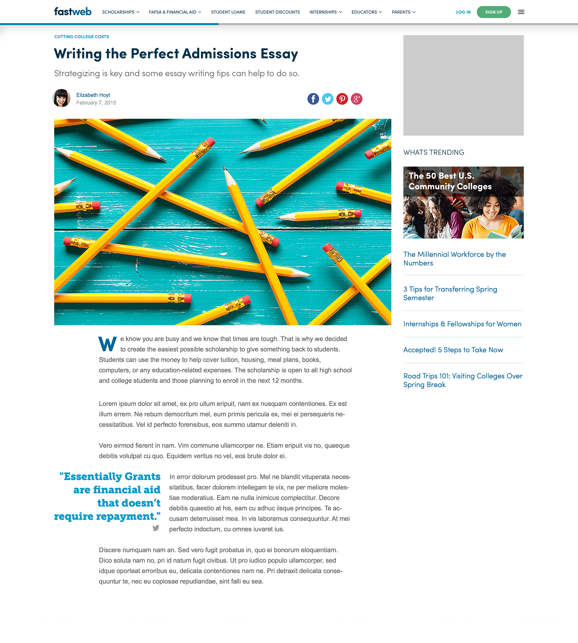
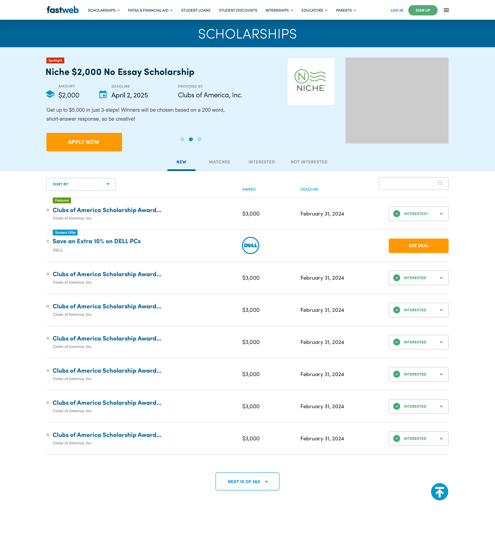
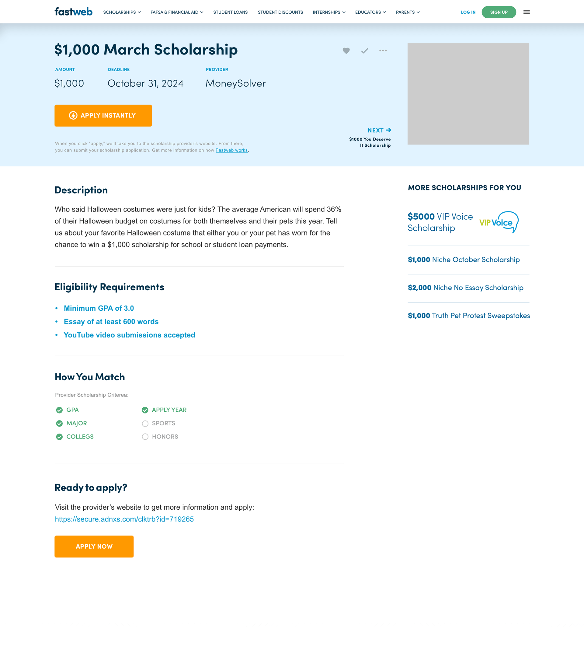
That same modular grid extended beyond the homepage to the dashboard, deals, resource library, articles, and scholarship detail pages, so this shipped as one consistent system rather than a one-off landing page.
Solving for Scholarship Organization
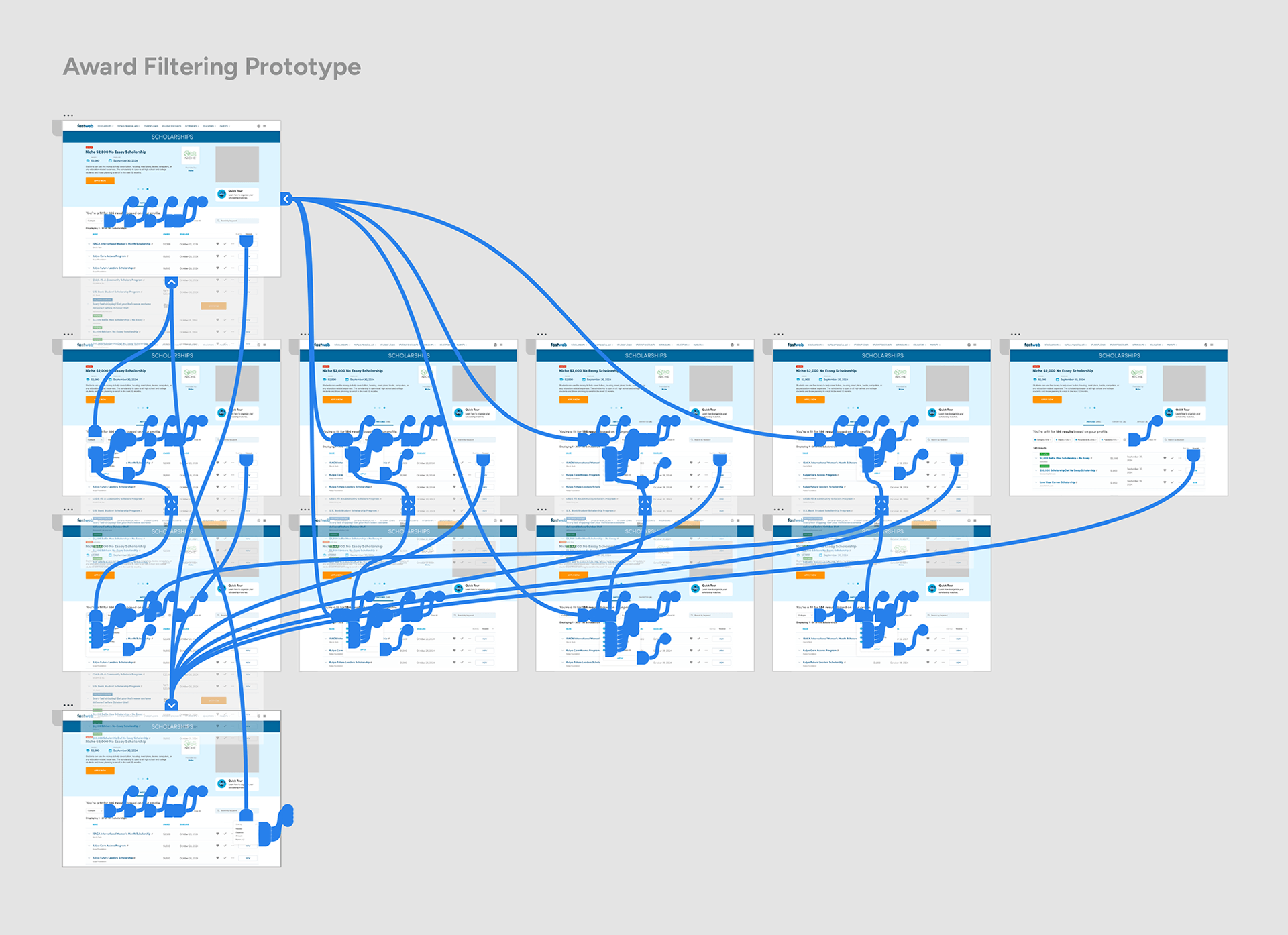
On the product side, NPS feedback pointed squarely at scholarship organization as the biggest friction point for new members. Rather than hand stakeholders a static comp, I built a working prototype so they could click through real interaction and react to the actual experience before development started.
Making Status Tracking Visual
I replaced the old status dropdown with visual status icons plus a "More" option for faster tagging, and built new transactional emails that trigger automatically whenever a member sets a scholarship status.
Robust Filtering
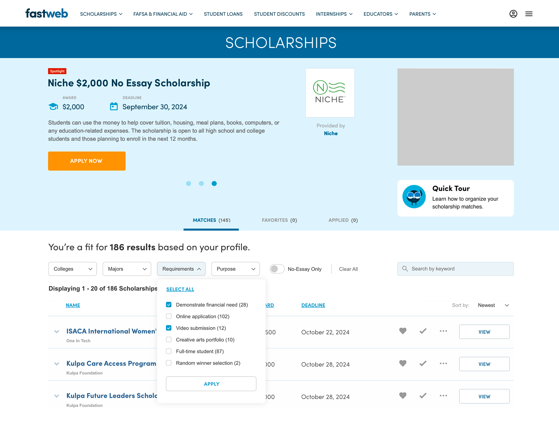
The system that came out of it replaced a single "sort by date" option with real filtering: by college, major, and requirements, giving members a far more powerful way to surface the scholarships they actually qualify for.
Helping Members Find What Changed
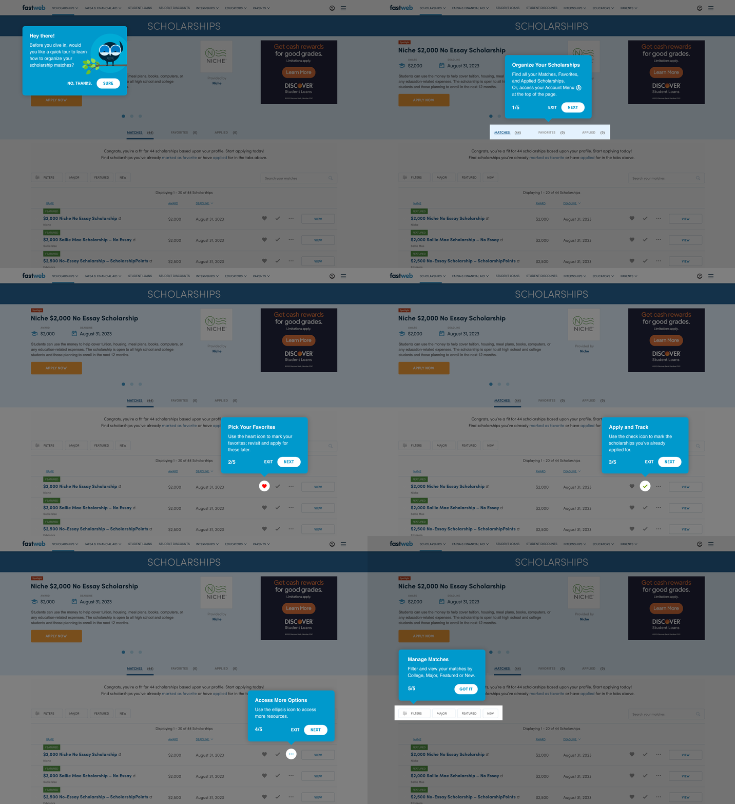
After everything moved through development and shipped, I designed a 5-step onboarding walkthrough to introduce members to the new tools, paired with a companion article.
After everything moved through development and shipped, I designed a 5-step onboarding walkthrough to introduce members to the new tools, paired with a companion article.
Results and Business Impact
A homepage built to earn traffic.
Pairing a modernized visual identity and SEO-optimized copy with a mobile-first layout drove the 78.7% increase in monthly site visits and the 4-point gain in organic search traffic share, translating into a 20.6% increase in average monthly new members.
Faster load times through a real image strategy.
Standardizing on next-gen formats and the three-size responsive image system cut page weight without sacrificing visual quality, directly supporting the traffic and conversion gains above.
A real system of Scholarship organization.
The new filtering system, status icons, the 5-step onboarding walkthrough, and status-triggered emails gave members a coherent way to track their matches instead of a single flat list, directly addressing the friction NPS respondents flagged.
Stakeholders reacted to a working product.
Building the filtering system as a functional prototype let stakeholders test real interaction and give informed feedback before a single line of production code was written.