

ROLE: Creative Direction, Product Design Manager
TEAM: Andy Jansma, Senior Product Designer
CLIENT: Military.com (enterprise clients including Delta)
TOOLS: Figma, Adobe Suite
TEAM: Andy Jansma, Senior Product Designer
CLIENT: Military.com (enterprise clients including Delta)
TOOLS: Figma, Adobe Suite
Challenge
Military.com is the #1 Google result for "Military" on both desktop and mobile, and pulls a bigger monthly audience than any other publisher in its category, but the NPS had slipped from 46 to 37 in a year, and annual pageviews were trending downward. A cramped 970px layout, a dated type pairing, and a rigid right rail were limiting both the reading experience and advertising flexibility, while pages built on aging Drupal widgets felt cluttered rather than curated. The site needed a full redesign and a real design system behind it, without disrupting the newsroom's daily publishing schedule.
Impact at a Glance
25% lift
in member growth from a redesigned metered-gating modal on article pages
11% increase
in new user signups from a data-driven redesign of the registration/onboarding flow
5.8 million
monthly unique visitors, more than any other military-focused publisher tracked in the same competitive set
in member growth from a redesigned metered-gating modal on article pages
11% increase
in new user signups from a data-driven redesign of the registration/onboarding flow
5.8 million
monthly unique visitors, more than any other military-focused publisher tracked in the same competitive set
Solution
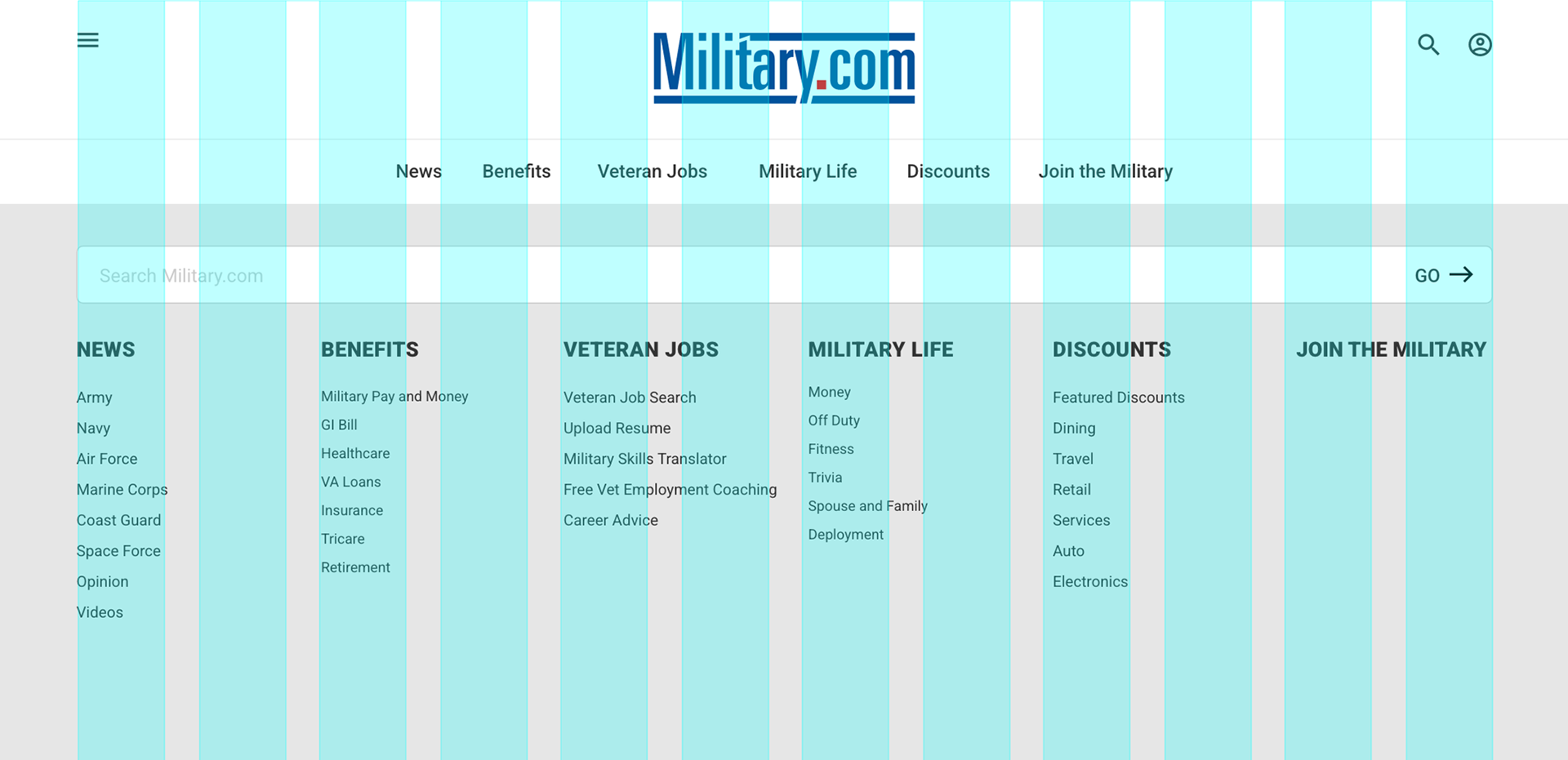
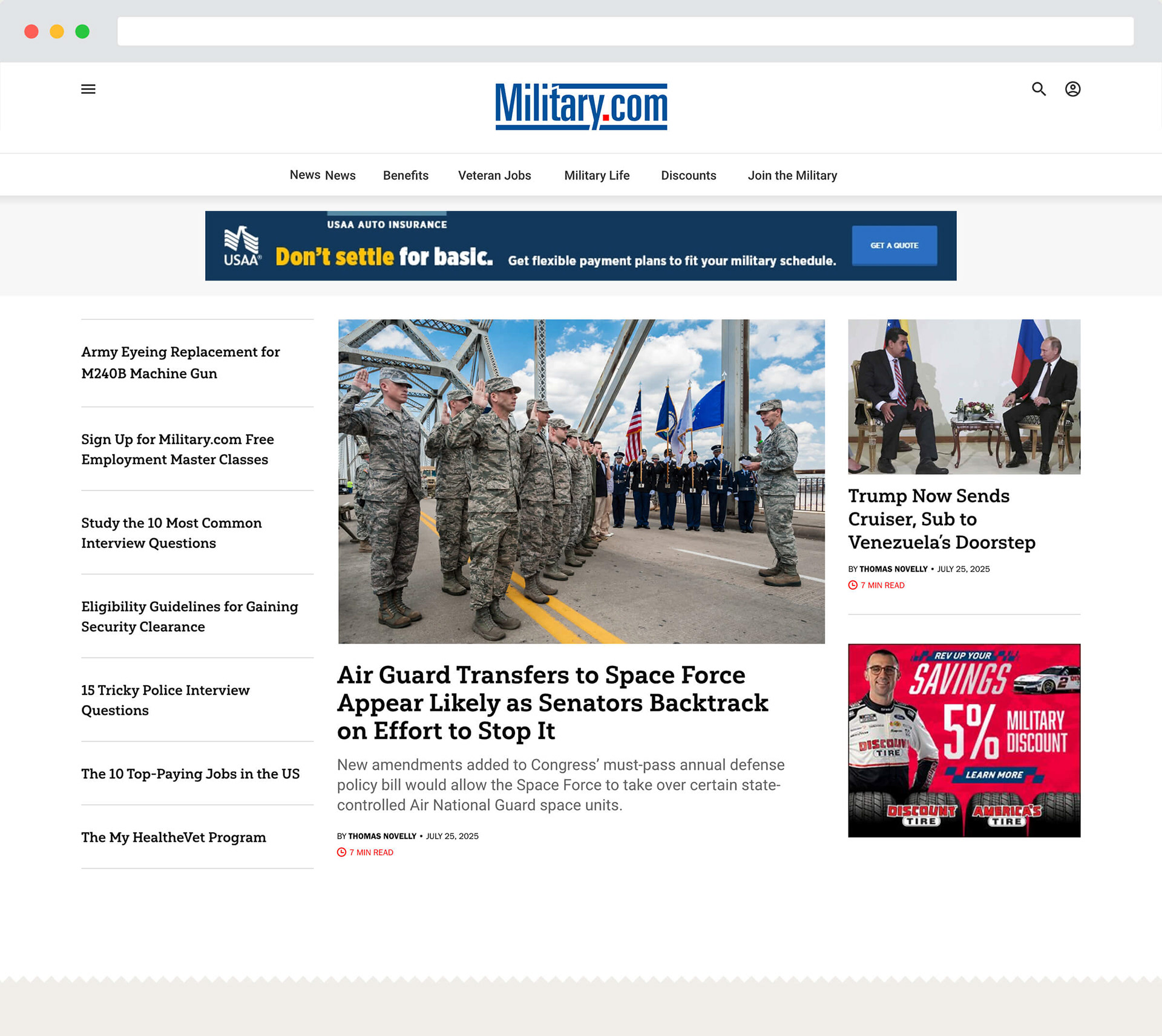
I led the visual and system-level redesign of Military.com end to end. I widened the site from 970px to a 1290px responsive grid and redesigned the navigation, bringing fully functional prototypes to stakeholders for sign-off rather than static comps.
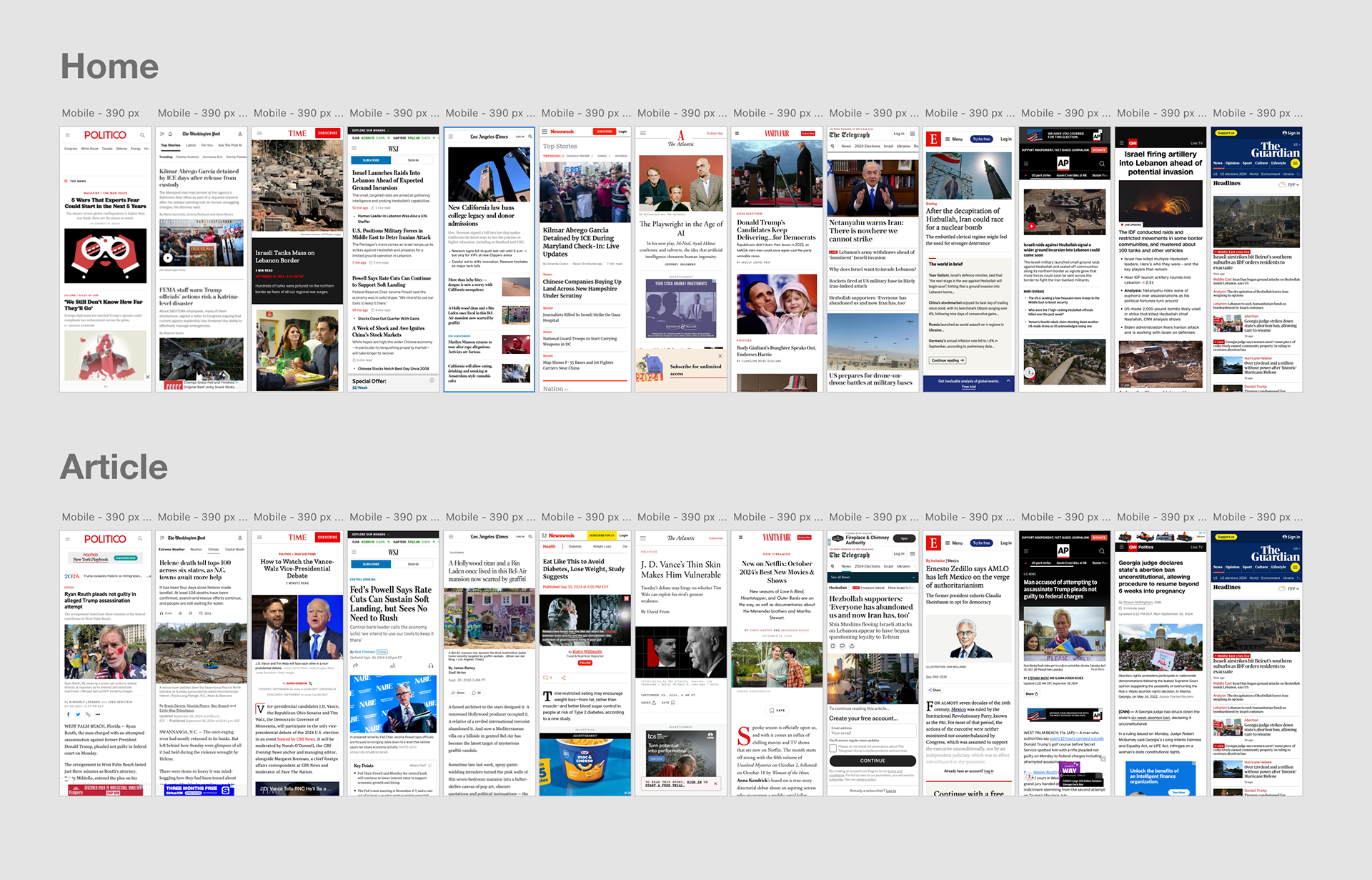
UX Competitive Audit
I audited competitor homepages and article pages across layout, typography, and mobile adaptability before designing a single screen.
Style Guide & Design System
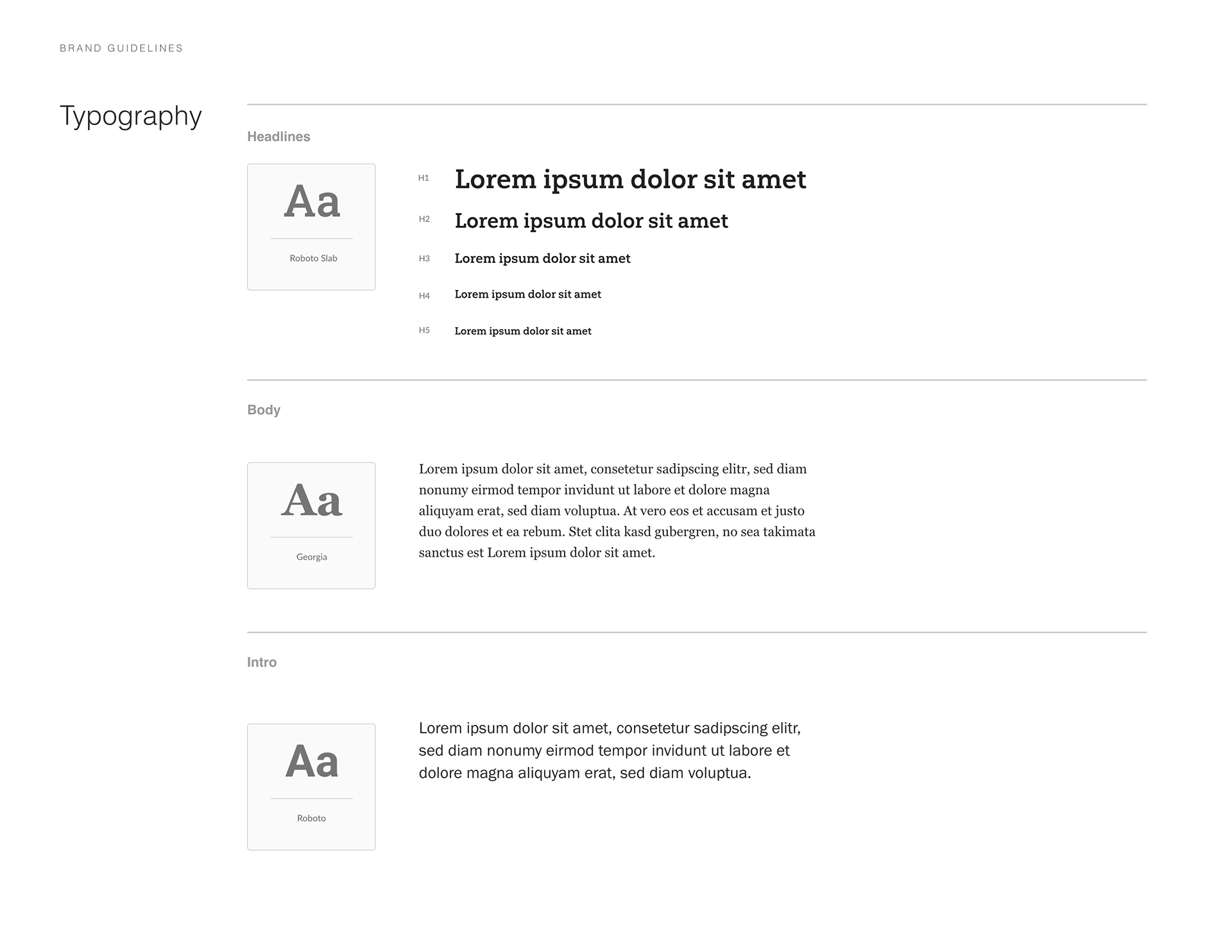
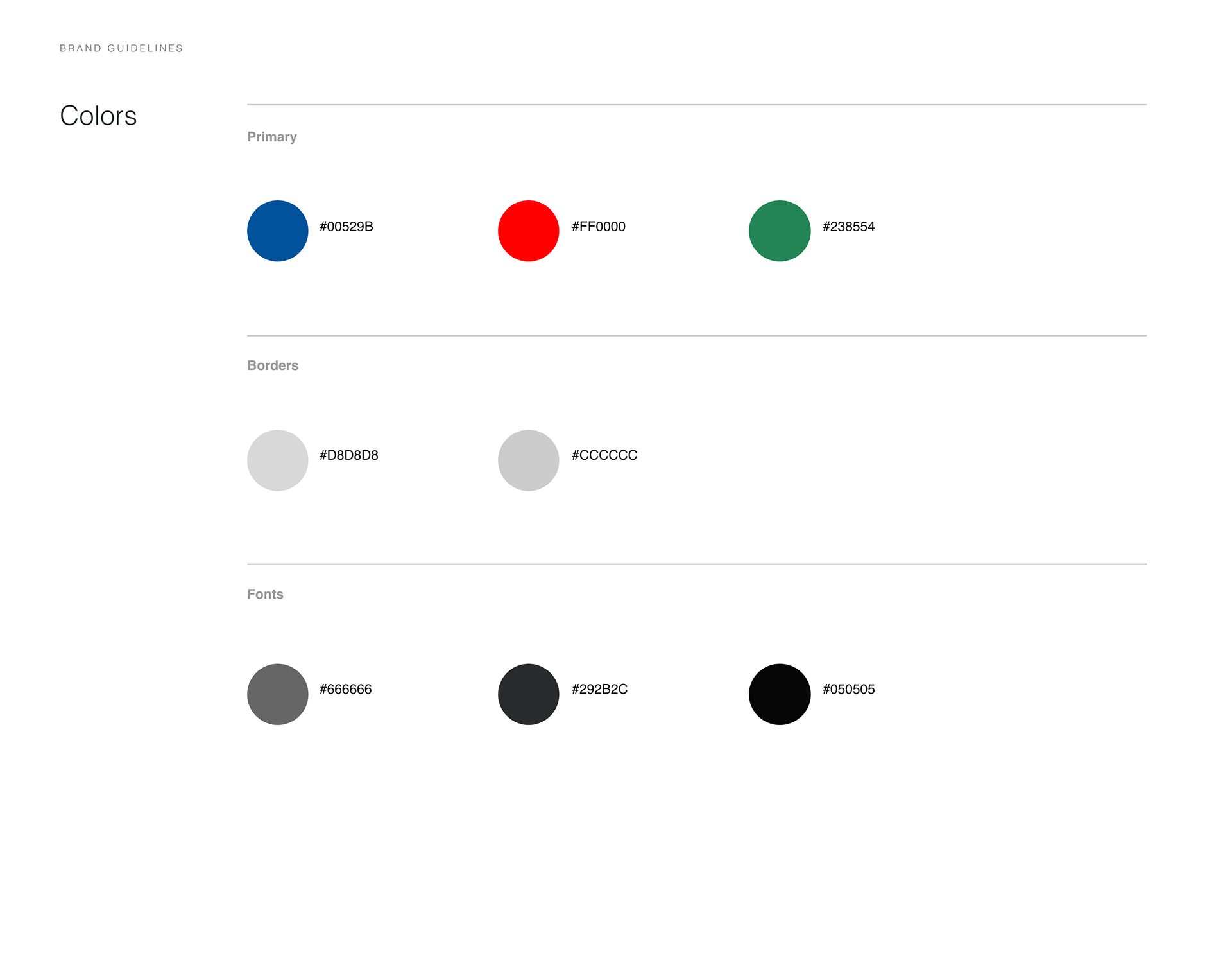
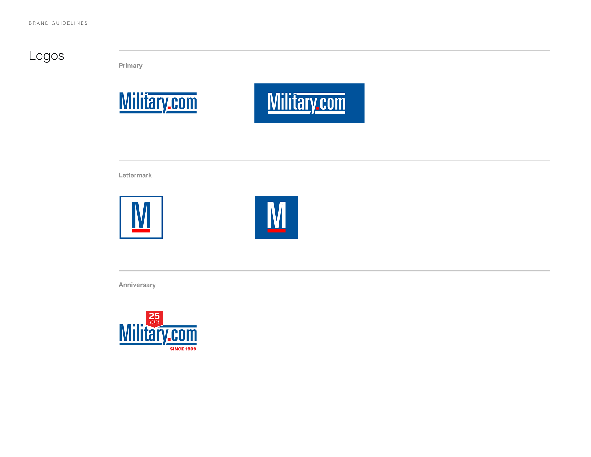
Starting with a full audit of existing Drupal components before designing anything new, I rebuilt the style guide around Yorkten Slab headlines and Georgia body copy, replacing the dated Roboto pairing, and used that foundation to build out a centralized design system: a single library of components, colors, typography, and grid rules meant to bridge design and engineering so the product could scale without every page becoming a one-off.
Backbone of the Redesign
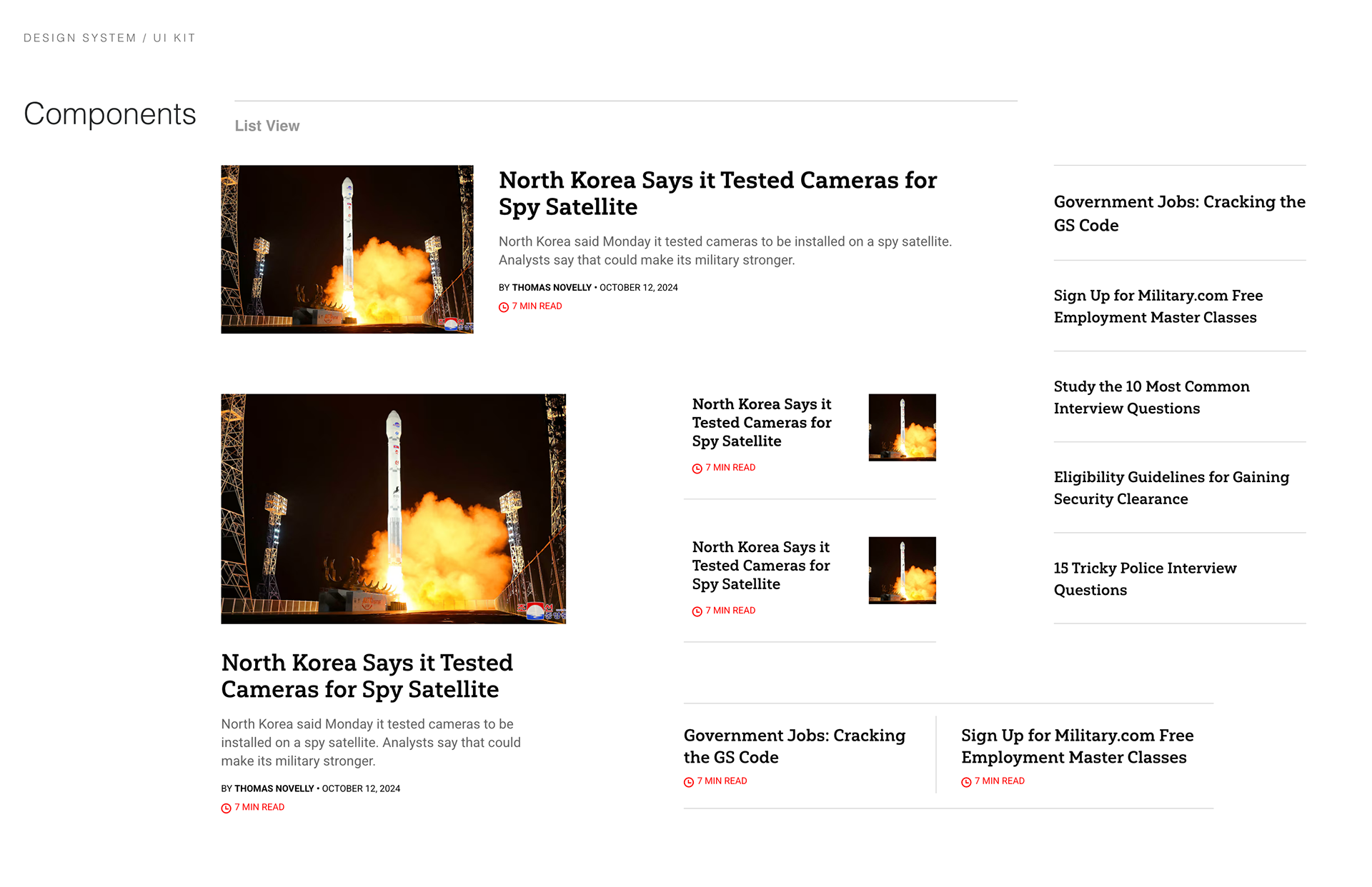
I started with the List View component, since it's the most-used pattern on the site, designing it mobile-first with multiple display modes (thumbnail, text-only, two-column, carousel) before moving to desktop. This component became the backbone of the redesign, built to flex across thumbnail, text-only, two-column, and carousel display modes without breaking the underlying grid.
I started with the List View component, since it's the most-used pattern on the site, designing it mobile-first with multiple display modes (thumbnail, text-only, two-column, carousel) before moving to desktop. This component became the backbone of the redesign, built to flex across thumbnail, text-only, two-column, and carousel display modes without breaking the underlying grid.
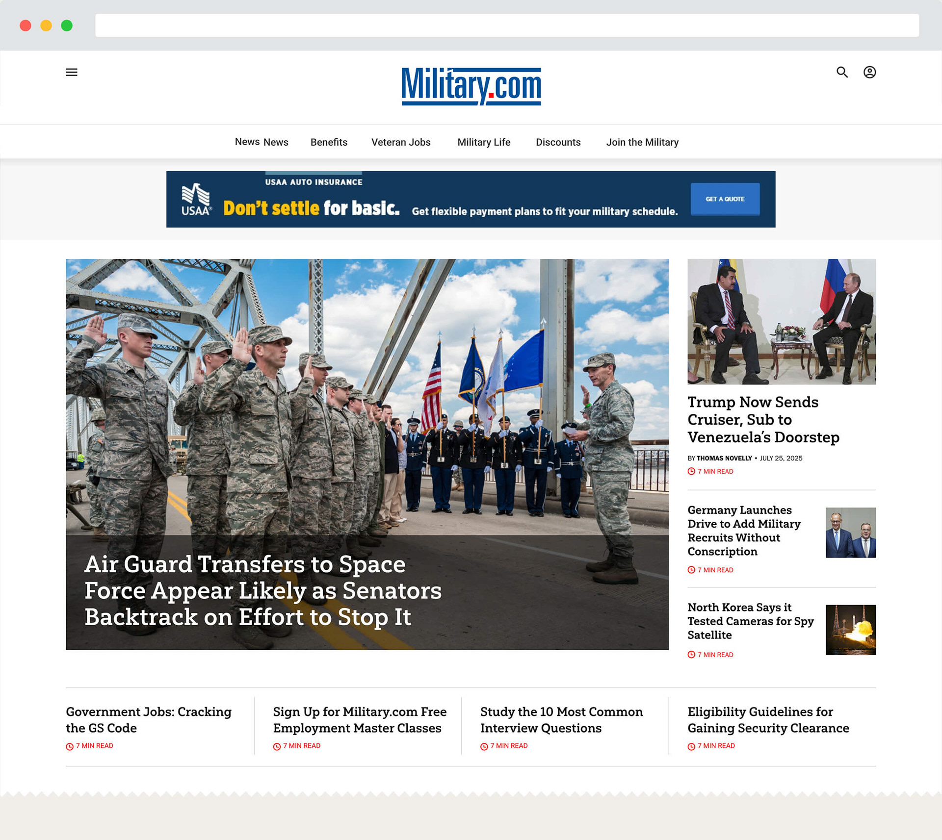
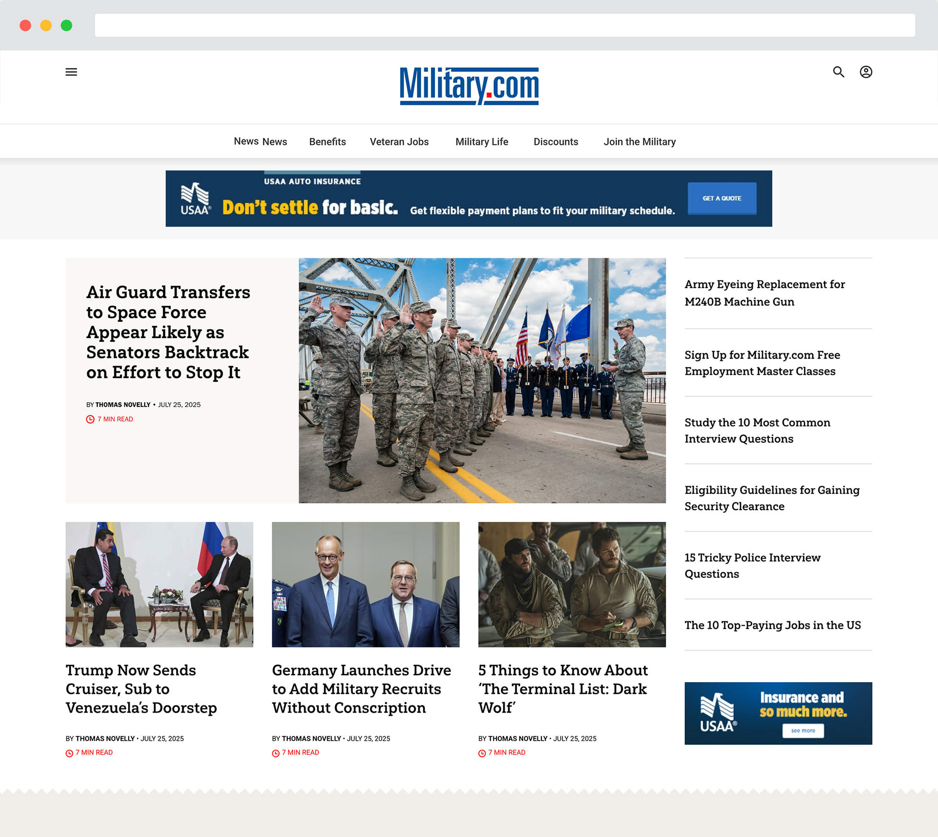
On the homepage, I delivered multiple proof-of-concept layouts built on that same list-view system, informed by a competitive audit of outlets like The New York Times, The Guardian, and Politico across homepage structure, navigation taxonomy, and mobile adaptability, plus mobile versions for each direction.
Refreshing the Reading Experience
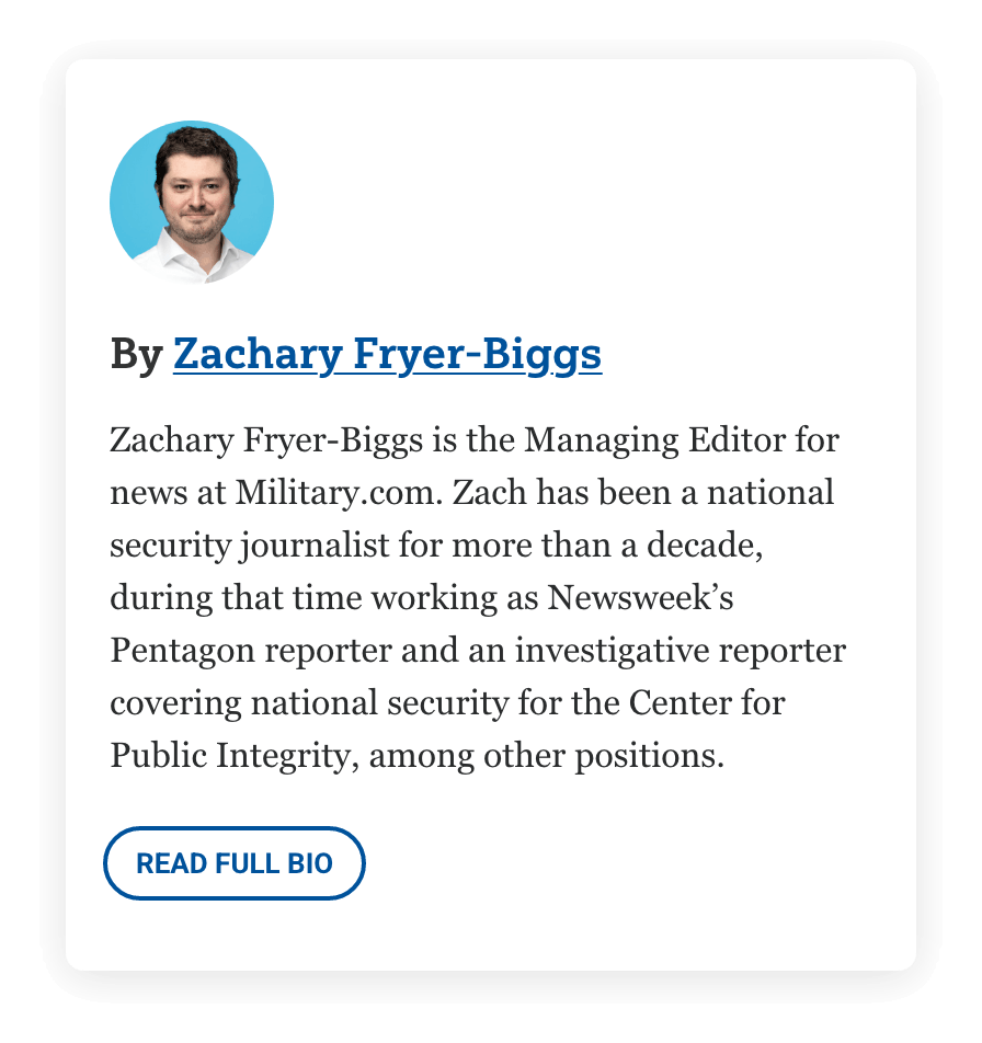
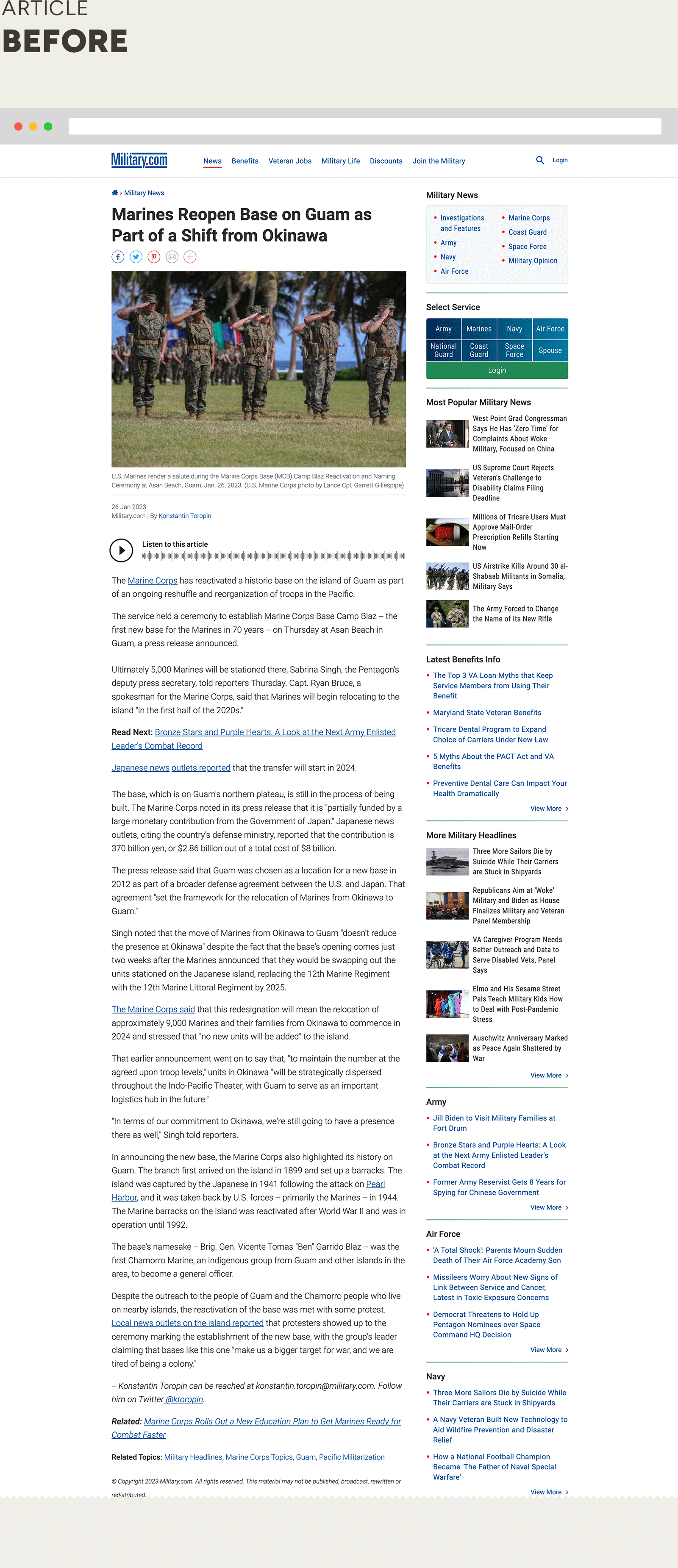
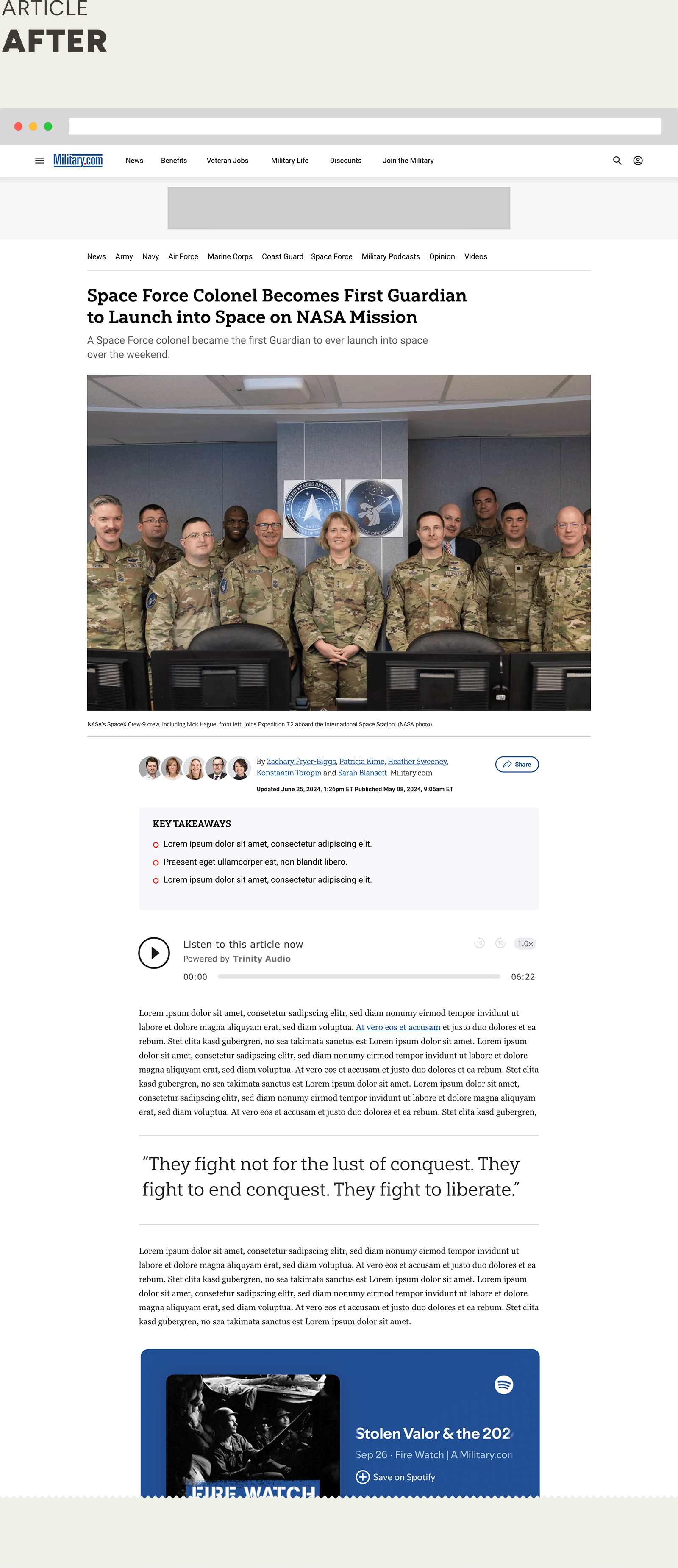
Article pages got the biggest structural change: I removed the static right rail to open up room for in-article and native ad placements, then added a pull-quote component, an Author Bio footer, and a byline system supporting up to five contributor headshots, up from a single author. I also designed a content carousel to reduce scroll fatigue and a "Key Takeaways" widget summarizing each article, and worked with editorial to consolidate scattered social-share icons into a single share button.
Because the newsroom's photo library had grown inconsistent over the years, I also directed a photoshoot with the Chief Managing Editor to standardize the journalist headshot library that powers the new byline and bio components.
Because the newsroom's photo library had grown inconsistent over the years, I also directed a photoshoot with the Chief Managing Editor to standardize the journalist headshot library that powers the new byline and bio components.
A Format Worthy of the Story
Alongside the standard template, I designed a full-width "special edition" long-form/scrollytelling template for major investigative and multimedia pieces: a fluid, edge-to-edge layout opening with a massive cover image, video, or data visualization, built for stories like the site's investigations into unsupervised military child-care oversight and troops' unprotected exposure to hazardous chemicals.
Focus on Member Growth
Two of the redesign's growth-facing pieces sat outside the article and homepage templates: I redesigned and prototyped the metered-gating modal that prompts readers to register after a set number of free articles, and separately redesigned the site's registration and onboarding flow end to end. Both were data-driven, built to reduce friction at the exact moments readers were deciding whether to become members.
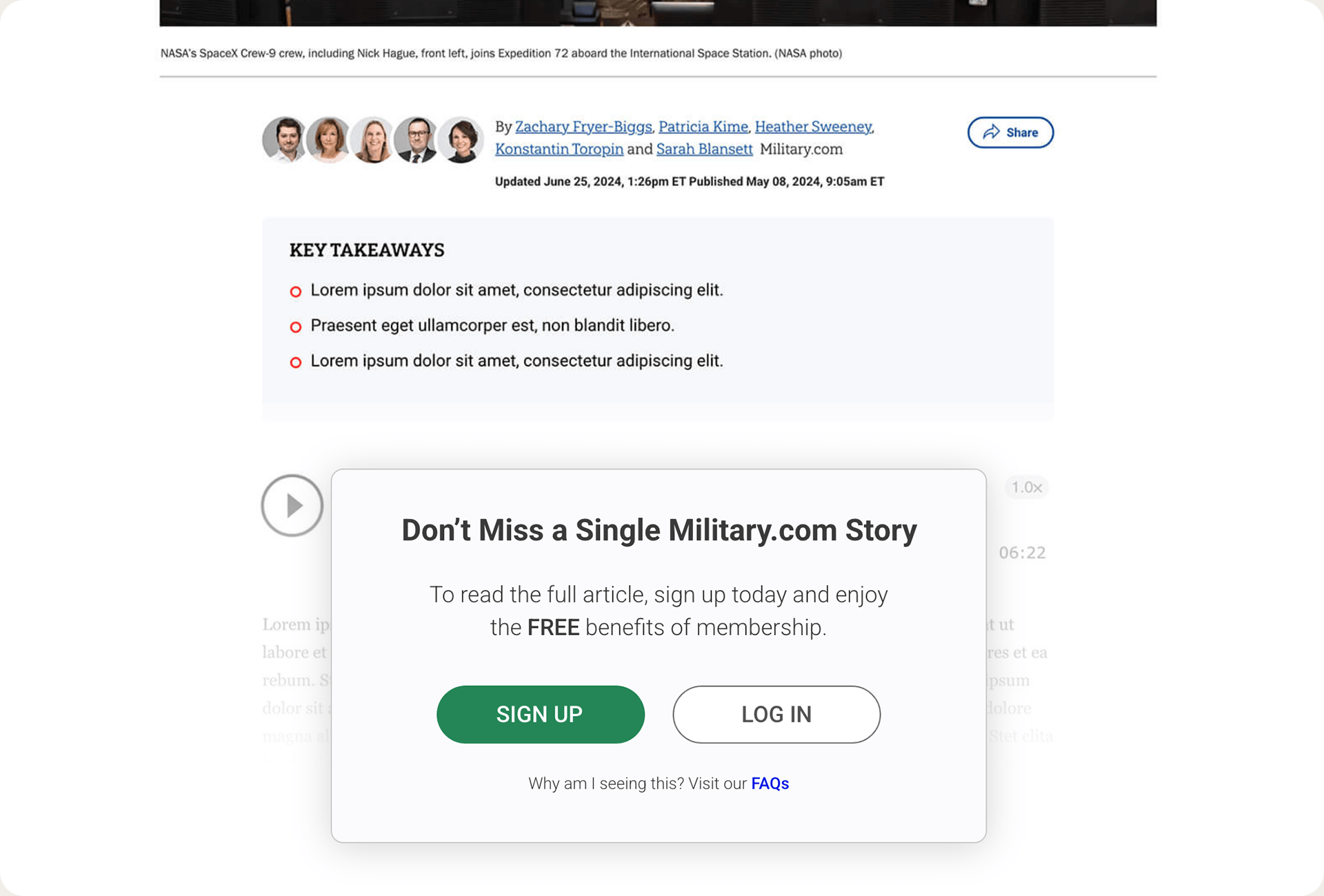
25% lift in member growth from the redesigned metered-gating modal.
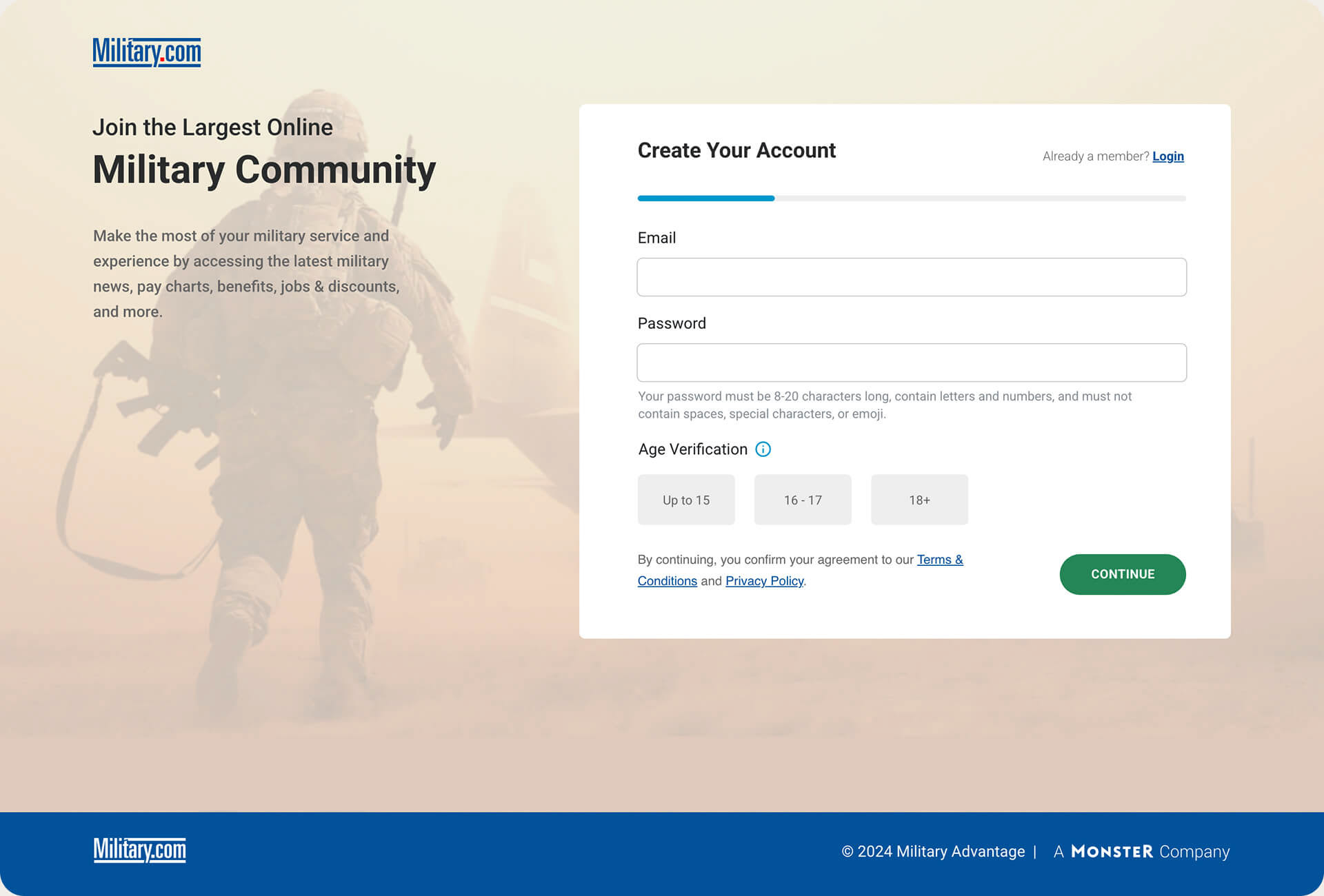
11% increase in new user signups from the registration/onboarding redesign.
Results and Business Impact
A redesigned gate turned into a growth lever.
The metered-gating modal on article pages delivered a 25% lift in member growth, turning a moment that often reads as friction into one of the site's strongest paths to membership.
Registration got the UX rebuild it needed.
A data-driven redesign of the registration and onboarding flow lifted new user signups 11%, closing the gap between an interested reader and a registered member.
A design system built to outlast the redesign.
The centralized component library (grid, typography, colors, and reusable modules) gave design and engineering a shared source of truth, so new pages and features could be built consistently instead of one-off.
A navigation redesign proven before it shipped.
Bringing stakeholders fully functional prototypes, not static comps, let them sign off on real interaction rather than a guess at how it would feel, catching issues a flat mockup would have missed.
More room for the content that matters.
Removing the static right rail on article pages opened space for pull-quotes, an expanded byline, a "Key Takeaways" widget, and better-placed advertising, all while keeping the focus on headline, image, and copy.
A premium format for the newsroom's biggest stories.
The special-edition long-form template gave investigative and multimedia reporting (the kind that's driven real changes to military policy) a presentation worthy of the reporting itself.
A data-driven redesign of the registration and onboarding flow lifted new user signups 11%, closing the gap between an interested reader and a registered member.
A design system built to outlast the redesign.
The centralized component library (grid, typography, colors, and reusable modules) gave design and engineering a shared source of truth, so new pages and features could be built consistently instead of one-off.
A navigation redesign proven before it shipped.
Bringing stakeholders fully functional prototypes, not static comps, let them sign off on real interaction rather than a guess at how it would feel, catching issues a flat mockup would have missed.
More room for the content that matters.
Removing the static right rail on article pages opened space for pull-quotes, an expanded byline, a "Key Takeaways" widget, and better-placed advertising, all while keeping the focus on headline, image, and copy.
A premium format for the newsroom's biggest stories.
The special-edition long-form template gave investigative and multimedia reporting (the kind that's driven real changes to military policy) a presentation worthy of the reporting itself.